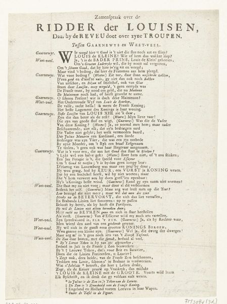
graphic-art, print, typography
#
script typeface
#
yellowing
#
graphic-art
#
neoclassicism
# print
#
editorial typography
#
paragraph style
#
typography
#
stylized text
#
thick font
#
handwritten font
#
classical type
#
word imagery
#
historical font
Dimensions: height 573 mm, width 490 mm
Copyright: Rijks Museum: Open Domain
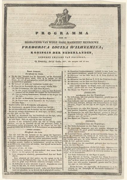
Curator: This dense field of text presents "Spelregels voor het Vaderlands Historiespel, 1816," or "Rules for the National History Game, 1816," a print by Hendrik Gartman. Editor: Immediately, I notice the strong contrast. The dark text leaps off the page against the yellowish paper; the composition looks balanced, even rigorous. Curator: Gartman was interested in fostering national pride after the Napoleonic era, using games as educational tools. Consider this print's materiality: relatively cheap paper, mass-produced with movable type, meant to reach a broad audience. Editor: Right, the repeated use of geometric forms and lines dividing the paragraphs creates a kind of hierarchy of information and the typeface, while not overtly stylized, leans toward a classical type aesthetic that mirrors this sentiment of national pride you've mentioned. Curator: Precisely, the very act of disseminating these rules through print participates in the burgeoning public sphere, creating a sense of collective identity linked to knowledge of national history. Note how he leverages typography to guide the reader through complex information, all feeding into the didactic purpose of the "game." It uses typography to separate ideas which in itself promotes a means for national identity to take root. Editor: But observe the detail: dense, closely packed paragraphs are still challenging to navigate despite this attempt for some separation. And the paper's condition gives it a antique and somewhat historical and cultural feel. Curator: The somewhat challenging nature contributes to how learning the game is supposed to create knowledgeable players, and again promote the educational component. Furthermore the materiality—paper and ink produced with increasing efficiency due to industrial developments—speaks to wider socio-economic shifts within Dutch society at the time. The use of typography, which while standard is used to produce distinct identities between components to make them understandable Editor: Indeed, it brings the material processes right to the fore in a powerful way, doesn’t it? It all speaks volumes about how new accessible ways of communication can alter culture through national pride and unity, both ideas being portrayed using type. Curator: And it shows a unique glimpse of education during post-Napoleonic era Holland, both things that come to mind viewing the components individually but seeing their use shows its implications and a lasting image to create this very unity and pride you speak of.
Comments
No comments
Be the first to comment and join the conversation on the ultimate creative platform.
More like this