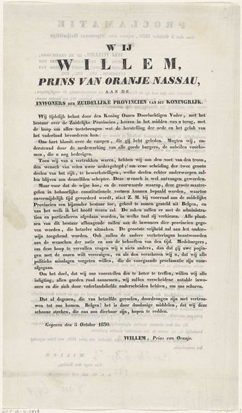
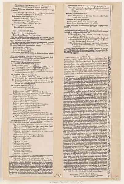
graphic-art, print, paper, typography, engraving
#
script typeface
#
graphic-art
#
script typography
#
dutch-golden-age
# print
#
old engraving style
#
hand drawn type
#
paper
#
text
#
typography
#
thick font
#
handwritten font
#
golden font
#
classical type
#
word imagery
#
engraving
#
historical font
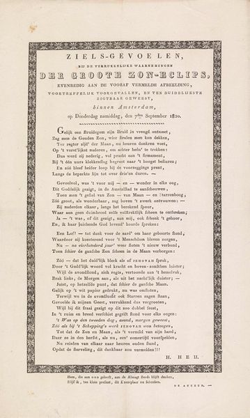
Dimensions: height 222 mm, width 258 mm
Copyright: Rijks Museum: Open Domain
Editor: This is "Tekstblad behorende bij Monument voor Johannes Noordink," a print from 1822. Looking at the tight typography and old engraving style, I find myself drawn into the world of 19th-century Dutch text. What do you see when you examine this piece? Curator: From a formalist perspective, the artwork offers a complex interplay between positive and negative space. The density of the text creates a visual texture, while the varying fonts create a hierarchy that subtly guides the eye. Notice how the hand-drawn quality of the script infuses it with character. It is also essential to observe that even as a printed reproduction, it carries traits of graphic art as if it were an independent and autonomous artwork. Do you feel that this piece celebrates the typography of the text rather than prioritizing legibility? Editor: I hadn't considered the interplay of space so carefully. I initially viewed it as simply a block of text, but I now see the varying thicknesses and forms. It does feel celebratory, less about function and more about showcasing script and typeface as image. Is that a common thing for a print such as this one? Curator: Exactly. If it only had a functional purpose, the text could have been presented simply with a less "historical" and "hand-drawn" look to increase its functionality. It's this careful consideration of texture, form and layout that elevates the print beyond mere words. The engraver aimed to show off their medium by incorporating "word imagery". It gives an excellent example of the cultural approach to this technique back in the Dutch Golden Age! Editor: That makes me realize how much intention went into designing every aspect. Now, it feels more like an artist working with ink, lines, and form rather than just someone writing. Curator: Precisely! You're seeing now how close readings can offer new insight into typography. Editor: I will try to incorporate this attention to form and structure in my upcoming papers!
Comments
No comments
Be the first to comment and join the conversation on the ultimate creative platform.
More like this