print, paper, typography
# print
#
paper
#
typography
#
watercolor
Copyright: Rijks Museum: Open Domain
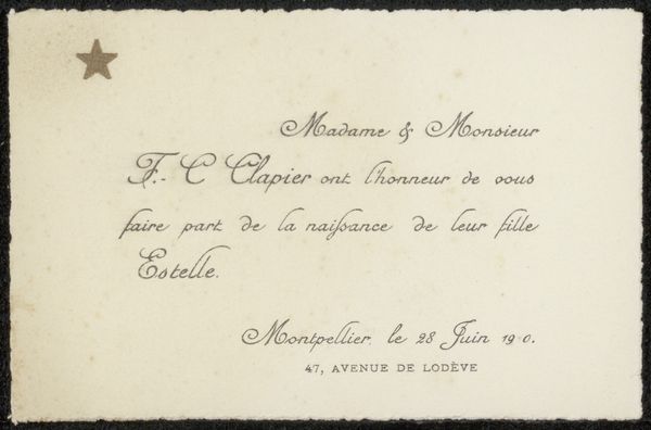
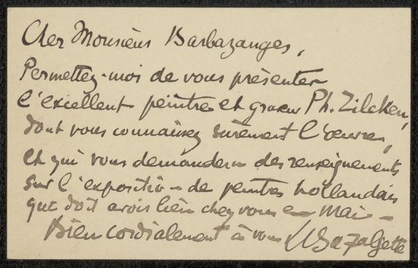
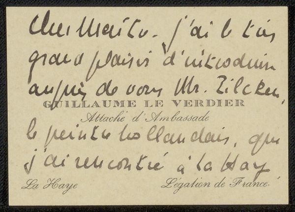
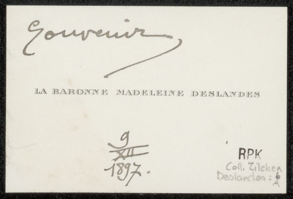
Editor: This is a print from before 1899, residing in the Rijksmuseum: 'Bedankkaart aan Philip Zilcken.' It seems simple, just some names listed in beautiful typography. Yet, there's also this faded triangle pointing towards the text, creating an ethereal and, well, sort of ghostly vibe. What catches your eye when you look at this? Curator: Ah, it whispers of bygone eras, doesn't it? To me, it evokes the intimacy of correspondence and the ritual of acknowledgment. Envision late 19th-century Paris; these names likely belong to individuals within literary circles. Each carefully chosen font implies a social decorum, and I sense a real intentionality behind each printed letter. But look closely at the triangle – is it merely an aesthetic touch? Or perhaps… do you think it subtly indicates the sender's humility, pointing towards those whom they thank? Editor: Humility is an interesting angle! It's like this ethereal quality almost masks what is inherently just a note of thanks. I guess I hadn't considered that it could actually reveal as much as it conceals. Curator: Exactly! Sometimes what we perceive as concealment is, in fact, a spotlight on something deeper. It nudges us towards questioning social dynamics within intellectual circles of the time. It’s not just a card; it's a keyhole glimpse into a world of writers, their interconnectedness and the unspoken rules that governed their exchanges. Now, doesn’t *that* bring it to life in an unexpectedly loud way? Editor: It really does! It seemed like such a simple piece at first glance. Thank you, it gave me a lot to think about. Curator: My pleasure. The true magic, my dear friend, resides in the unfolding layers – like those subtle triangular shapes – we discover with a little curious reflection.
Comments
No comments
Be the first to comment and join the conversation on the ultimate creative platform.
