drawing, paper, ink
#
portrait
#
drawing
#
script typography
#
hand-lettering
#
old engraving style
#
hand drawn type
#
feminine typography
#
hand lettering
#
paper
#
ink
#
hand-drawn typeface
#
fading type
#
thick font
#
symbolism
#
handwritten font
#
calligraphy
Copyright: Rijks Museum: Open Domain
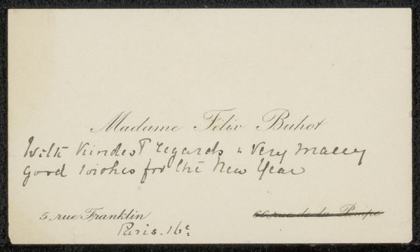
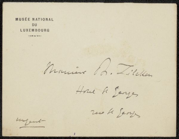
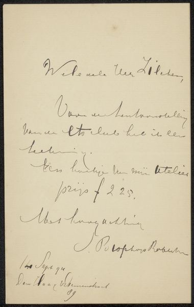
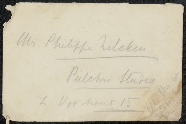
Curator: We're looking at "Visitekaartje aan Philip Zilcken", or "Visiting Card for Philip Zilcken", dating from 1867 to 1898, attributed to Stéphané Mallarmé. It's an ink drawing on paper. Editor: My initial thought is the visual balance—or imbalance. The density of the lettering versus the open space feels intentional. The texture is nice too; you can almost feel the slight drag of the ink on the page. Curator: Absolutely. This piece speaks volumes about the social function of art, especially considering Mallarmé’s stature in literary circles. It wasn’t simply a message; the act of creating this personalized card with deliberate artistry elevates its importance. Editor: Right. And consider the material. It's not some mass-produced cardstock. It looks like handmade paper; the kind that would absorb the ink in a particular way. That intentionality tells us this was a deliberate, crafted object. Curator: It signifies more than a mere arrangement. Mallarme held a specific role, as printed directly on the card. As President of the Committee for a monument to Verlaine—it showcases Mallarme's place within the cultural elite of the period. The very existence of a committee dedicated to commemorating a poet says so much about the era's values. Editor: The fact that this message is delivered on a piece of art forces us to think about what materials communicate beyond text. The color of the ink, the thickness of the paper, all these details create layers of meaning, suggesting craftsmanship and maybe wealth. These types of details shape our impression of who Mallarmé and Zilcken were, more effectively even, than any printed text. Curator: Yes. The choice to present this information via stylized writing transforms a simple invite into something closer to a declaration. Editor: So this little scrap becomes this intersection of artistic production, personal relationship, and the means of communicating and making connections through material gestures. Food for thought about the power of everyday objects, really. Curator: Indeed. A seemingly simple piece, but its historical and cultural weight is substantial. Editor: Definitely seeing this piece in a new way, and its connection to craft.
Comments
No comments
Be the first to comment and join the conversation on the ultimate creative platform.
More like this