Toelichtingen bij voorstellingen van de negen muzen 1653 - 1654
0:00
0:00
janphilipszschabaelje
Rijksmuseum
#
aged paper
#
toned paper
#
tea stained
#
personal sketchbook
#
journal
#
coloured pencil
#
golden font
#
watercolor
#
historical font
#
columned text
Dimensions: height 295 mm, width 370 mm
Copyright: Rijks Museum: Open Domain
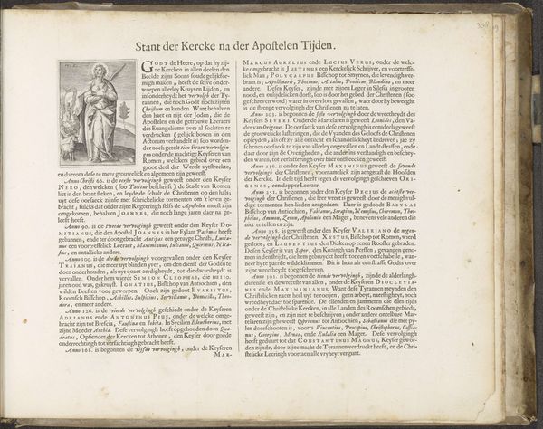
Editor: Here, we have a page from "Toelichtingen bij voorstellingen van de negen muzen," created by Jan Philipsz Schabaelje around 1653-1654. It's at the Rijksmuseum, a mix of watercolor and colored pencil on paper. It looks like an old book spread, with aged, almost tea-stained pages, filled with dense text. It has an antiquated look and, well, I'm a bit overwhelmed by all the text. What do you see in this piece, especially considering its age and format? Curator: Considering this work formally, one notices first the duality of the composition. Each page presents itself as a self-contained unit, yet they function in concert, unified by the spine and overall structure. The texture of the aged paper is integral; its yellowed tone provides a stark contrast with the golden-hued historical fonts used in the titles. Note how the text is formatted in column, imitating ancient codices. Ask yourself how those visual cues shape your perception of its purpose. Editor: So, it’s about how the elements combine to make meaning, beyond just the words themselves? The page layout becomes part of the "art." Curator: Precisely. It uses the structure and formal layout of book design. Do note the semiotic aspects. The coloured pencils, along with the aged paper and historic font all act together to give a very ancient or formal "look". It conveys information not just through text, but through historical symbols, arranged to mimic a valued tome, a religious one, of significance. This prompts one to think if the content of the pages can be seen through this lens. It may inform its function. Editor: It’s fascinating to think how the materials and structure contribute so much to the meaning, something I hadn’t really considered at first glance. Curator: Indeed, considering the artistic form encourages a broader understanding of intent and meaning.
Comments
No comments
Be the first to comment and join the conversation on the ultimate creative platform.
More like this