#
neo-pop
Copyright: Keith Haring,Fair Use
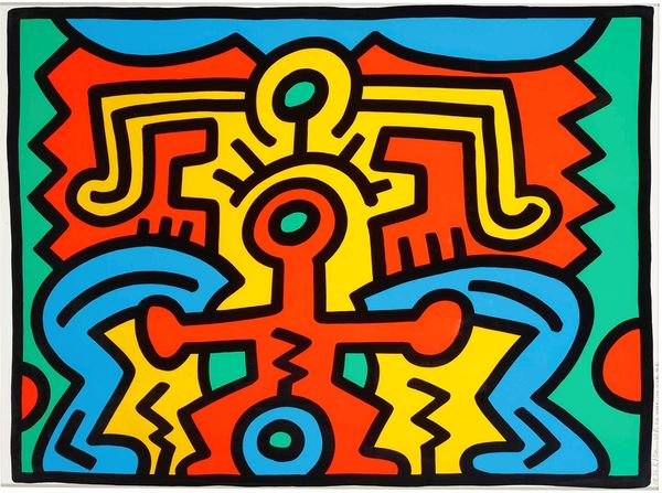
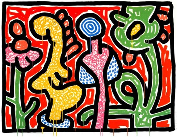
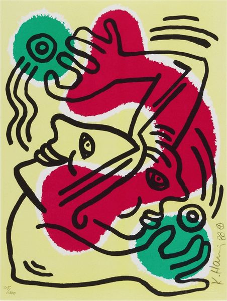
Keith Haring made ‘Lucky Strike’, sometime around 1987, though it feels like it could have been made yesterday. The flat, graphic approach, the bold lines, you see how it’s all so immediate. It’s all about getting the idea down, straight away. And those colors! Haring just goes for it with that pop art palette. Look at that green ground, it feels almost acidic, and the way it makes the red and yellow jump out at you. The thick black outlines are a crucial element here, giving a kind of cartoonish energy, which is part of the visual language of this piece. It reminds me a bit of Léger with its bright colors and solid lines, but Haring's got his own thing going on. It's like he's pulling from everywhere, but making something totally new, and that’s what art is all about, right?
Comments
No comments
Be the first to comment and join the conversation on the ultimate creative platform.
More like this