acrylic-paint
#
pop art-esque
#
popart
#
pop art
#
colour-field-painting
#
acrylic-paint
#
geometric-abstraction
#
pop art-influence
#
pop-art
#
line
#
pattern repetition
#
psychedelic
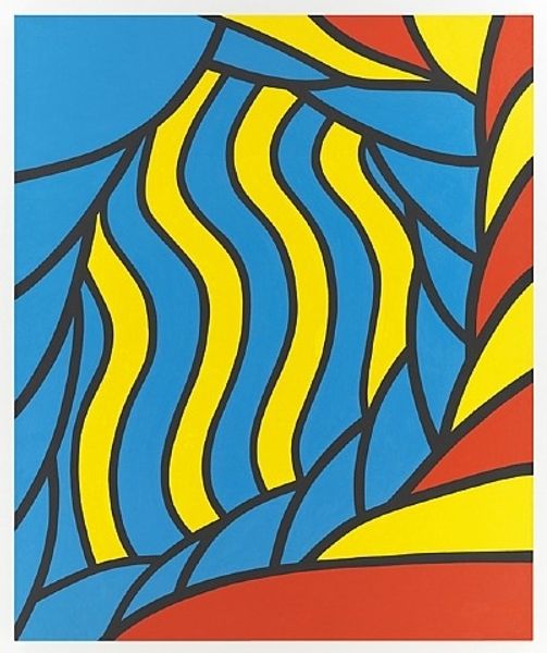
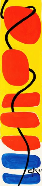
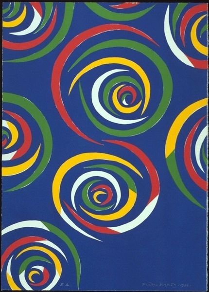
Copyright: Nicholas Krushenick,Fair Use
Editor: This is Nicholas Krushenick's "James Bond Meets Pussy Galore" from 1965, using acrylic paint. The title is definitely provocative! The bold colours and lines really vibrate. It’s kind of dizzying actually. What compositional elements stand out to you most? Curator: Initially, one is struck by the stark delineation of form. Note the unmodulated fields of colour bordered by assertive black lines. These contours establish discrete shapes and obviate any sense of depth, reducing the composition to a plane. How do the colours themselves affect your perception? Editor: The bright red, yellow, and purple feel very energetic, almost like they're clashing, yet somehow harmonious. They don't blend at all; it's all about contrast. Curator: Precisely. The artist deploys colour not as a means of representation but as an independent formal element, a device to activate the surface and to create visual tension. Observe the dynamic interplay between the curvilinear forms and the sharp, angular "leaves." What structural relationships can you identify? Editor: I see how the curved lines create a kind of rhythm, while the sharp angles introduce a disruptive element. It's almost like a visual argument! Does this create visual stability, instability, or a bit of both? Curator: A calculated instability, I would posit. The composition resists easy resolution, preventing the eye from settling into a passive mode of spectatorship. The hard edge painting and jarring palette challenge our sense of equilibrium. The artist's emphasis is on optical sensation over mimetic representation. Editor: I see what you mean. I went in expecting a narrative about James Bond but came out realizing the focus is all on the experience of seeing itself. Curator: Indeed. The title offers a point of departure, but the work’s significance resides in its manipulation of visual syntax. The title acts more like a wink and a nudge than any clear visual descriptor. The interplay of color and line creates an experience greater than just a picture of Bond meeting Pussy Galore. Editor: That’s a good point. Focusing on form helps us see the title as another tool within the artwork, just another layer of meaning and perception, and not something literal.
Comments
No comments
Be the first to comment and join the conversation on the ultimate creative platform.
More like this