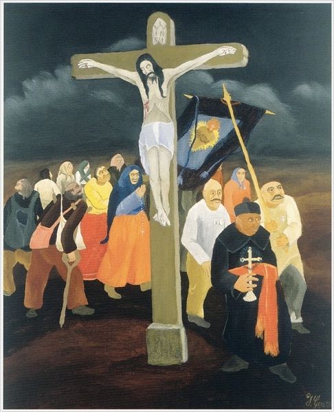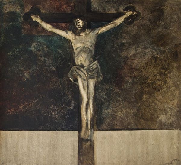
1915
The Crucifixion
Listen to curator's interpretation
Curatorial notes
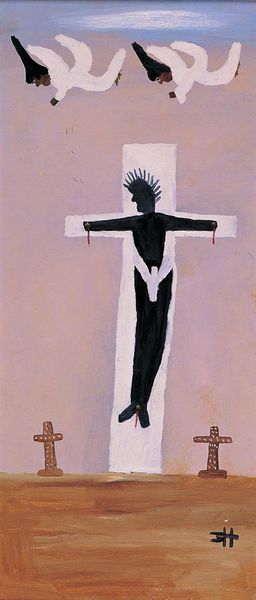
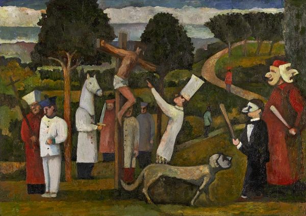
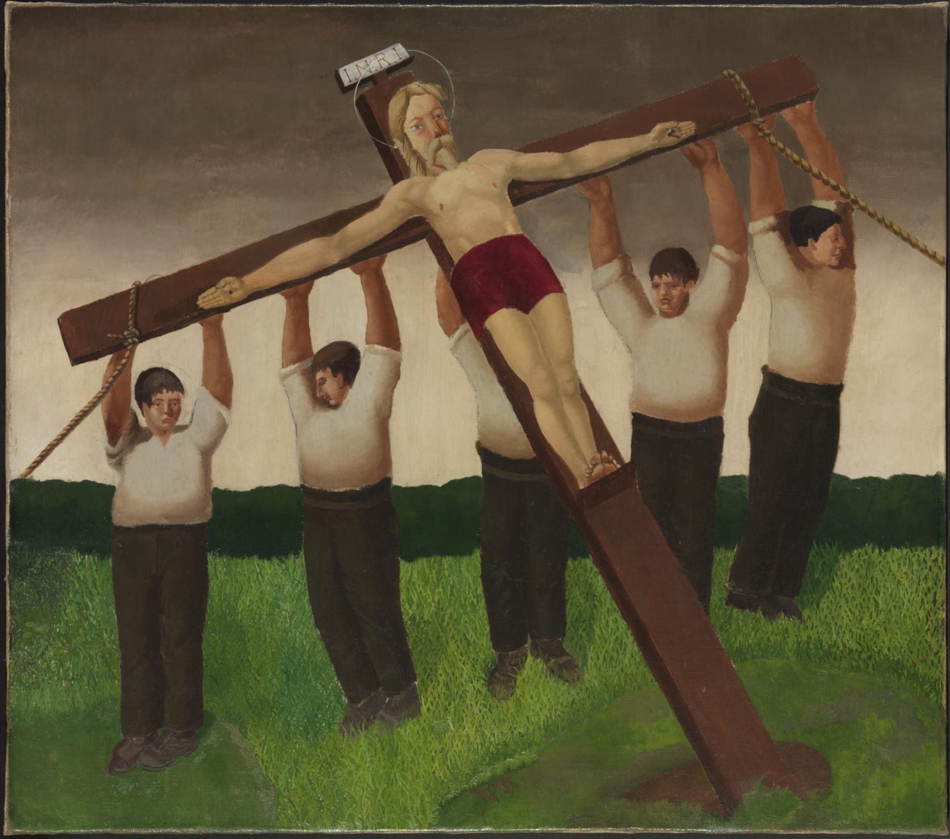
Editor: Here we have Gilbert Spencer's "The Crucifixion," held at the Tate. It's quite striking. The figures feel very grounded, almost like ordinary people. What formal elements stand out to you in this piece? Curator: Notice how Spencer uses a limited palette. The muted earth tones and the stark white shirts create a visual rhythm. Also, consider the geometric structure. The rigid cross juxtaposed with the figures produces a dynamic tension. Editor: So, it's less about religious symbolism and more about the relationships between shapes and colors? Curator: Precisely. The composition itself becomes the primary vehicle for meaning. It challenges our conventional expectations. What do you make of the positioning of the cross in relation to the ground? Editor: I see! The angle creates a sense of imbalance, like something is being uprooted. Curator: An astute observation! This careful manipulation of form is what makes Spencer's work so compelling. Editor: I see the painting differently now. Thanks for pointing out those key elements!