print, typography
#
script typeface
#
sand serif
#
script typography
#
paperlike
# print
#
personal journal design
#
typography
#
folded paper
#
thick font
#
publication mockup
#
thick lined
#
publication design
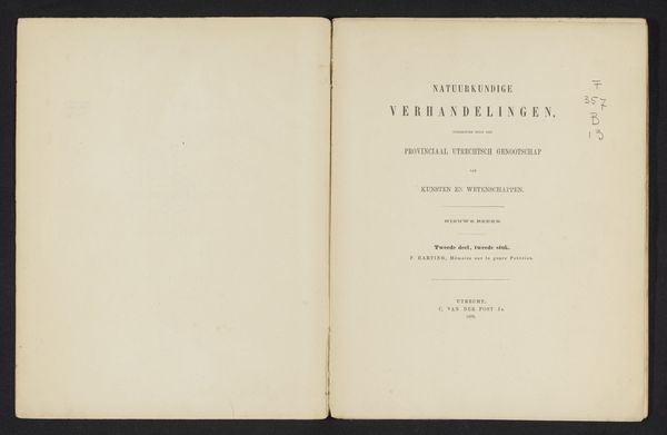
Dimensions: height 300 mm, width 237 mm, thickness 5 mm
Copyright: Rijks Museum: Open Domain
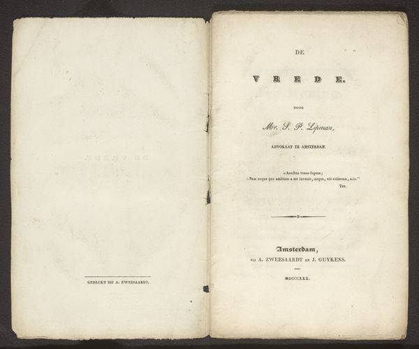
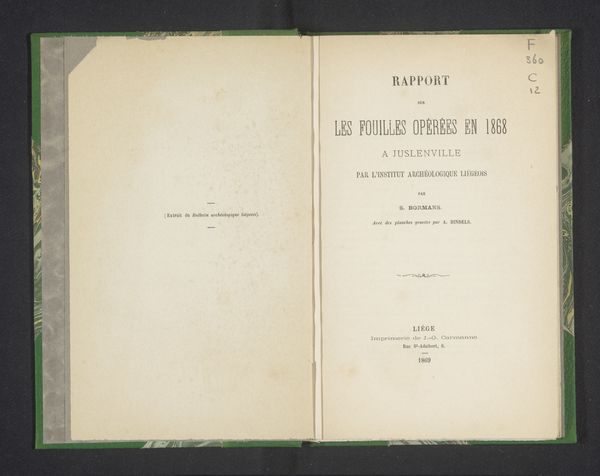
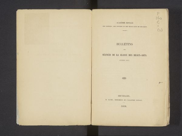
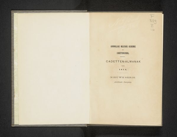
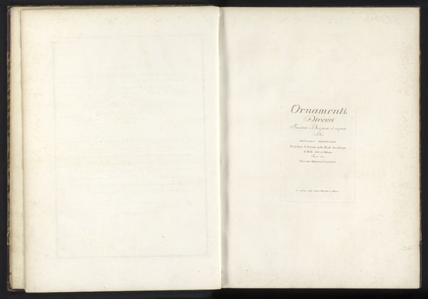
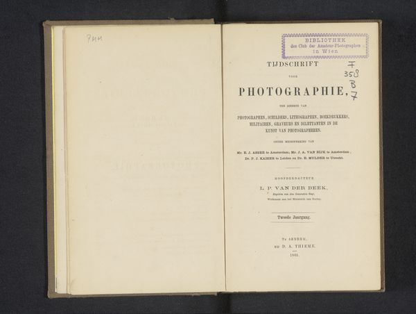
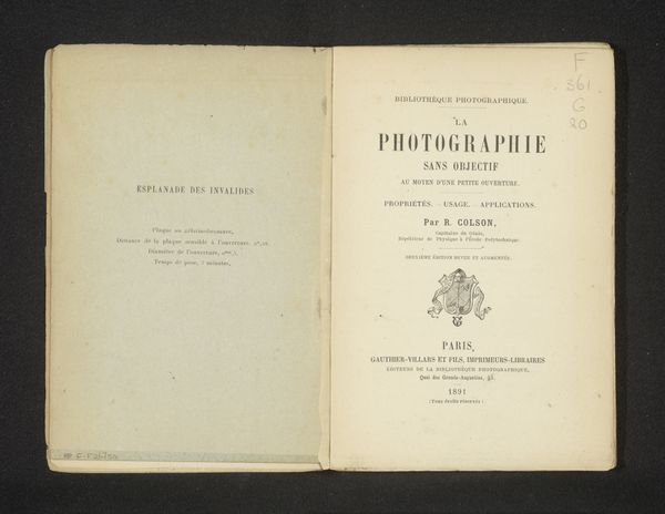
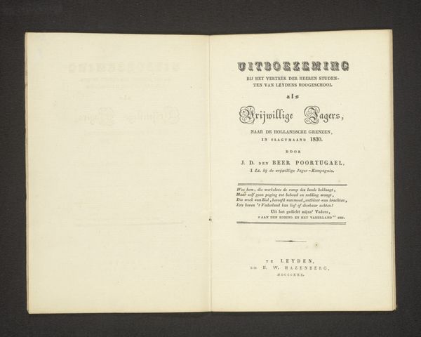
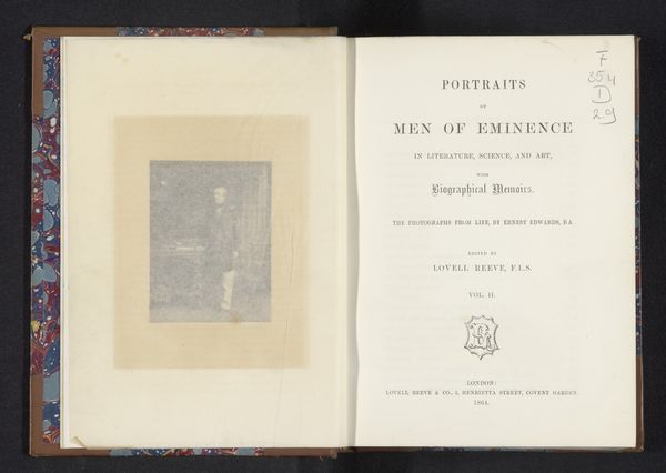
Pieter Harting created this print, Mémoire sur le genre potérion. The piece draws us in with its stark simplicity and balanced layout. The composition divides into two clean pages, each offering a field of pale paper whose surface has texture and is receptive to light. The eye is drawn to the right, where meticulously arranged typography forms a structured hierarchy. The text, rendered in a restrained black ink, has the title "POTERION" which serves as the focal point, a word both scientific and suggestive. The layout is structured, creating a visual framework that reinforces the scientific nature of the document. The typefaces are carefully chosen, and the size and spacing contribute to the overall sense of order and clarity. Each element of the page, from the letterforms to the margins, functions as a signifier within a semiotic system, conveying information but also hinting at broader cultural values of knowledge and precision. The blank space surrounding the text acts as a crucial element of design, emphasizing the contrast between void and information. It's not merely a backdrop, but an active component that shapes our perception. This print functions as a historical artifact, a snapshot of a moment when science and typography converged in a pursuit of knowledge.
Comments
No comments
Be the first to comment and join the conversation on the ultimate creative platform.
