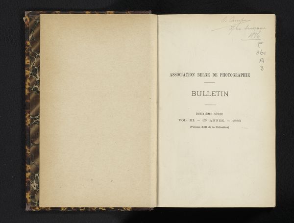
Tijdschrift voor photographie, ten dienste van photographen, schilders, lithographen, boekdrukkers, militairen, graveurs en dilettanten in de kunst van photographeren 1865
0:00
0:00
print, photography
#
aged paper
#
paperlike
# print
#
sketch book
#
hand drawn type
#
personal journal design
#
photography
#
personal sketchbook
#
journal
#
fading type
#
sketchbook drawing
#
sketchbook art
Dimensions: height 228 mm, width 147 mm, thickness 29 mm
Copyright: Rijks Museum: Open Domain
Editor: Here we have L.P. van der Beek's "Tijdschrift voor photographie...", a photography journal from 1865. The stark typography really jumps out at me. What visual elements strike you most about this print? Curator: The bilateral symmetry is paramount. Observe how the two pages, mirror images in their presentation, establish a formal tension. The texture of the paper itself becomes a significant component, creating visual depth through the aging process. Semiotically, this establishes the book as a repository of knowledge over time. Do you notice how the typographic choices emphasize particular words or phrases? Editor: Yes, the capitalization of "PHOTOGRAPHIE" really makes it stand out, and my eye is drawn to the varying sizes of the font used. Are these decisions purely aesthetic? Curator: Indeed, the contrast isn't merely decorative. Through variations in scale and typeface, a visual hierarchy emerges that draws the viewer into the page and creates a sense of order. This invites engagement. What philosophical implications might you derive from such an ordered presentation about photography in this era? Editor: I guess it suggests a systematic approach to photography as both a science and an art form? The layout itself presents photography as something considered and refined. Curator: Precisely. Reflect upon how the seemingly simple arrangement of text and the inherent materiality of the artifact communicates a much larger concept. Editor: That's fascinating! I’ll definitely look more closely at these aspects in future artworks. Curator: Excellent! These kinds of formal qualities and materiality can indeed give the viewer many interpretive doors.
Comments
No comments
Be the first to comment and join the conversation on the ultimate creative platform.
More like this