drawing, paper, ink, pen
#
portrait
#
drawing
#
hand written
#
script typography
#
hand-lettering
#
old engraving style
#
hand drawn type
#
hand lettering
#
paper
#
ink
#
hand-written
#
hand-drawn typeface
#
pen-ink sketch
#
pen work
#
pen
#
modernism
Copyright: Rijks Museum: Open Domain
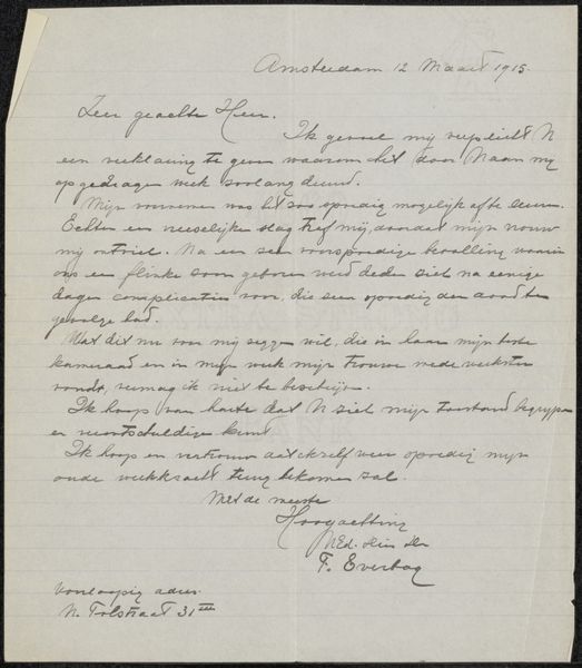
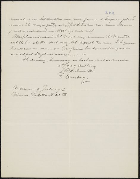
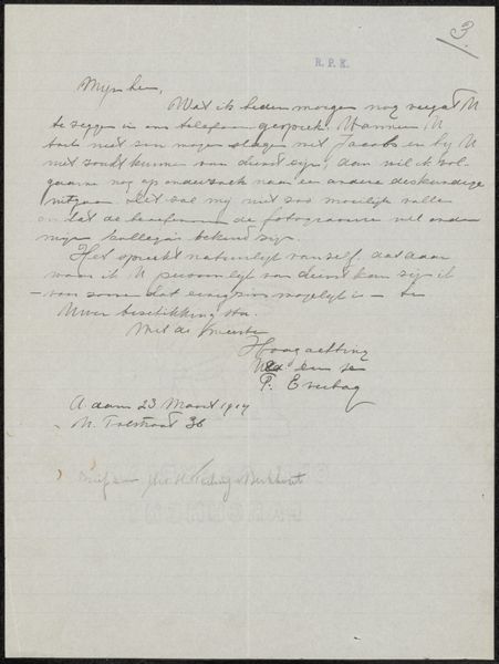
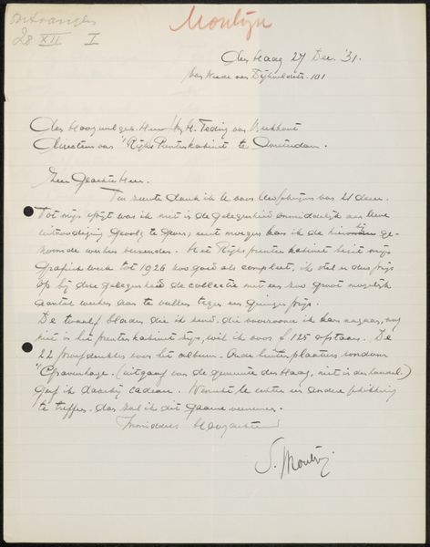
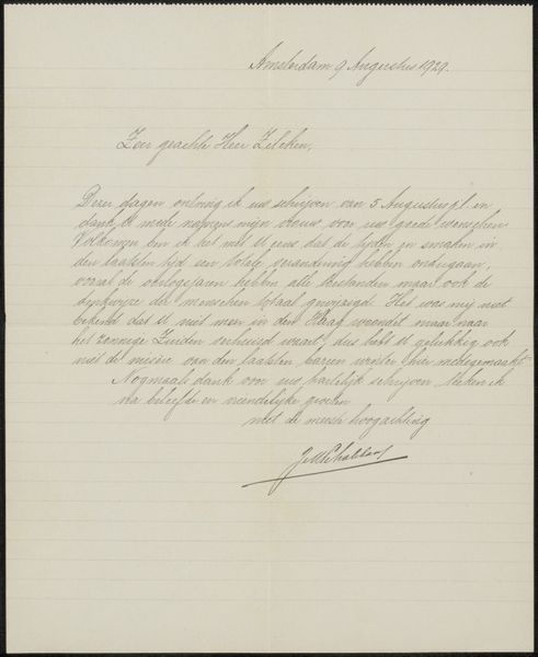
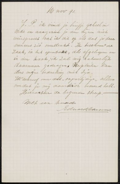
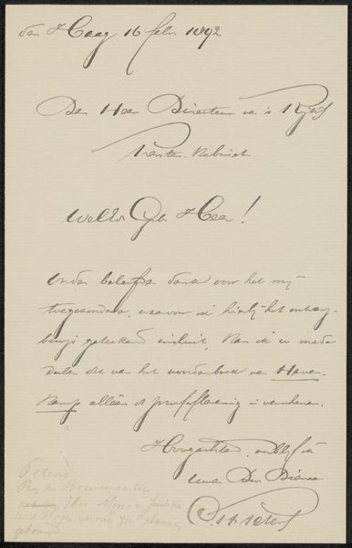
Curator: Here we have "Brief aan Mien Cambier van Nooten" – that’s "Letter to Mien Cambier van Nooten" – possibly from 1937, crafted by Juliana Christina Ket-Otten. Editor: My first impression is one of delicate intimacy. Look at that handwritten script – so fine, yet determined. It conveys such a personal sentiment, doesn’t it? Almost fragile. Curator: Indeed. The letter itself acts as a vessel, conveying cultural values through an intimate and expressive voice. It speaks of gratitude and connection, timeless human experiences. The act of writing itself is almost ceremonial here. Editor: I’m fascinated by the material reality of the letter. You have to consider the specific ink, the quality of the paper. Was it everyday stationary, or was it especially selected for the recipient? This dictates its availability but it adds layers to the meaning. It shows you its place within an economy of materials, access, and exchange. Curator: The ink, now faded slightly, would have originally appeared as a rich, dark tone creating contrast between paper and image. Its hand drawn typeface evokes the intimacy of a personal message over standardized type. The way that the forms connect shows a fluidity between letterer and recipient. Editor: The physical labor involved, the act of sitting down and carefully forming each word, highlights a dedication of the process, I am also drawn to think about labor conditions, like lighting. It creates its own emotional weight; a contrast to mass produced items like typewritten or printed messages. The difference lies here between functional versus expressive intent. Curator: Precisely. And consider, too, the L.O.L at the bottom... an ancestor of the modern internet acronym, but now appearing like ancient and encoded lettering with cultural history folded into the text. It prompts curiosity about their relationship and hints at a more carefree element undercurrent within its conventionality. Editor: In that sense, examining a letter like this allows to consider relationships beyond purely aesthetic; we can reveal intimate details about a historic material practice of communication and handwork – from sourcing materials to physical production as an alternative to technological change. Curator: So beautifully put. This drawing is so much more than ink on paper. It is memory and relationship brought to light by its graphic touch and its very personal human contact. Editor: Yes, and hopefully that consideration transforms the way we relate to both artistic and handmade output today.
Comments
No comments
Be the first to comment and join the conversation on the ultimate creative platform.
More like this