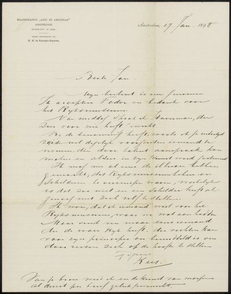
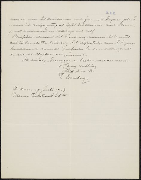
drawing, paper, ink
#
drawing
#
script typography
#
hand-lettering
#
hand drawn type
#
hand lettering
#
paper
#
ink
#
hand-drawn typeface
#
pen work
#
modernism
#
calligraphy
Copyright: Rijks Museum: Open Domain
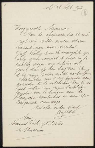
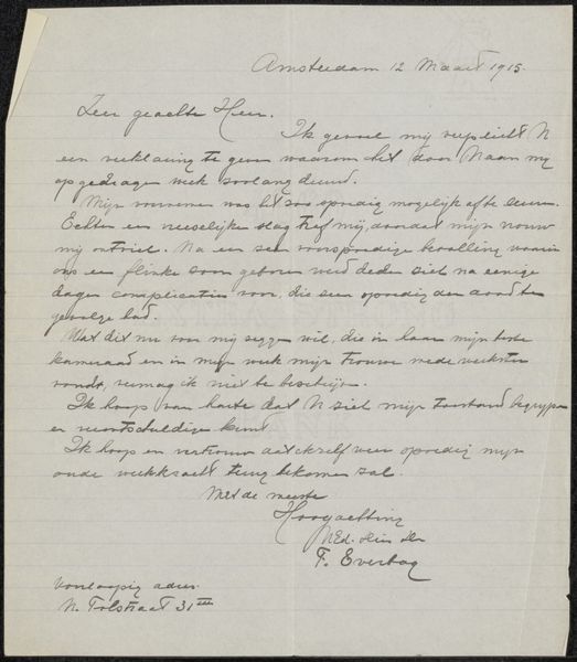
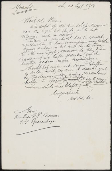
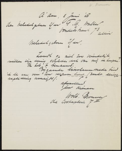
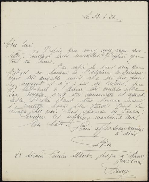
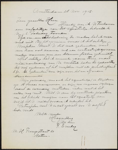
Curator: So, here we have August Allebé’s "Brief aan Burgemeester en Wethouders van Amsterdam," likely from 1907. It's an ink drawing on paper and currently held at the Rijksmuseum. What strikes you most about this piece? Editor: Well, the sheer volume of text and the elegant calligraphy create a formal and somewhat imposing atmosphere. The consistent pen strokes and carefully spaced lines contribute to an overall sense of order, even though it's handwritten. How do you interpret this work solely from its visual components? Curator: Primarily, I see a meticulous exploration of line and form. The contrast between the heavier strokes and delicate flourishes creates a dynamic visual texture. Note how Allebé uses varying letter sizes and weights to emphasize certain words, effectively constructing a visual hierarchy. Observe, too, the placement of the text on the page. The upper section contrasts with the final sentences at the bottom through the use of more flourish. Does this affect the structure, in your opinion? Editor: It does create some depth by clearly separating the message’s addressee from the sender, which are almost calligraphic signatures on either end of a single block of text. Curator: Precisely. By focusing on these intrinsic visual elements—the linework, the spatial arrangement, the play of light and dark—we can appreciate the aesthetic value of the work beyond its textual content. The question remains then whether this careful script is, in itself, part of Allebé's artistry. Editor: I never considered the pure artistry in calligraphy before, but I’m starting to see that there are aspects beyond simple information delivery when type and handwriting blend this way. Curator: Indeed. A closer look encourages one to read handwriting as carefully as one might regard the subject of any painted canvas. Editor: That's a completely fresh angle for me; thank you!
Comments
No comments
Be the first to comment and join the conversation on the ultimate creative platform.
More like this