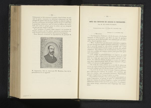
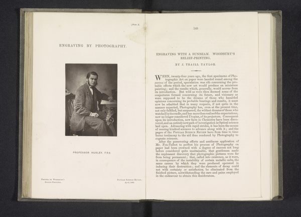
#
portrait
#
script typeface
#
written text
#
script typography
# print
#
typeface
#
editorial typography
#
stylized text
#
thick font
#
handwritten font
#
classical type
#
thin font
Dimensions: height 191 mm, width 133 mm, thickness 24 mm
Copyright: Rijks Museum: Open Domain
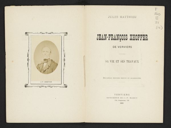
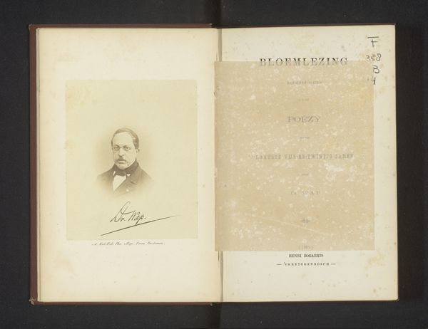
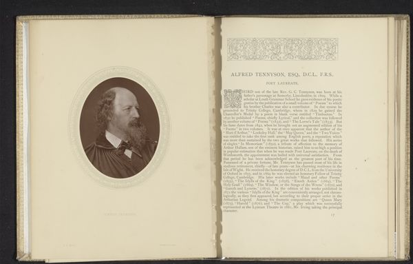
Editor: This is an image of a page from a book called "Richard Cobden and the Free Traders" by Lewis Apjohn, from around 1885. The book appears old. It has script typeface and what looks like a framed portrait on the left-hand page. It looks like a rather dry historical document. What stands out to you? Curator: Ah, not dry at all! See how the portrait on the left is echoed by the facing page with its dedication and typographic portrait of Cobden and the free traders. These layouts of paired pages echo those in illuminated manuscripts. We feel their historical weight and symbolic power even today. Editor: Can you elaborate on that? The typographic portrait? Curator: The lettering. Think of it not merely as information, but as a deliberate visual representation, each font and line break imbued with meaning. The placement of the words, the typeface chosen for 'Richard Cobden' – these elements create a visual hierarchy, directing our gaze and shaping our understanding of his importance. What emotions does that evoke in you? Does the symmetry carry its own symbolic load? Editor: It feels like an attempt to give him almost saint-like status, placing his image next to the words as an equal, a lasting memorial of his legacy and historical impact. Is that reading too much into it? Curator: Not at all. The book as artifact links him, in your mind and in the public imagination, to notions of virtuous action. A carefully crafted impression designed to influence public opinion long after Cobden's death. Editor: I’ll definitely look at books differently after this. It makes me think about the messages hidden in plain sight. Curator: Indeed, Editor! Every font tells a story.
Comments
No comments
Be the first to comment and join the conversation on the ultimate creative platform.
More like this