drawing, ink, pen
portrait
drawing
comic strip sketch
pen drawing
dutch-golden-age
pen sketch
personal sketchbook
ink
idea generation sketch
ink drawing experimentation
pen-ink sketch
pen work
sketchbook drawing
pen
post-impressionism
sketchbook art
calligraphy
Copyright: Rijks Museum: Open Domain
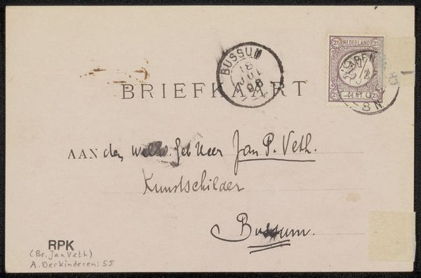
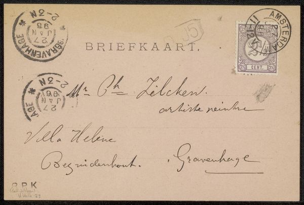
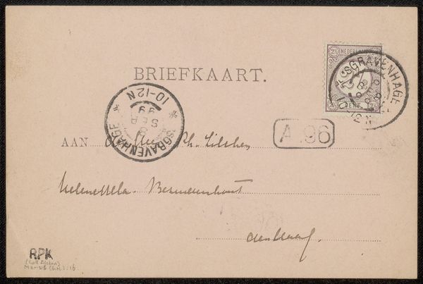
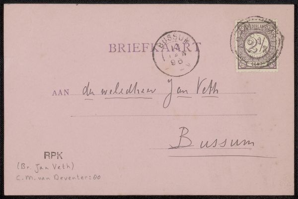
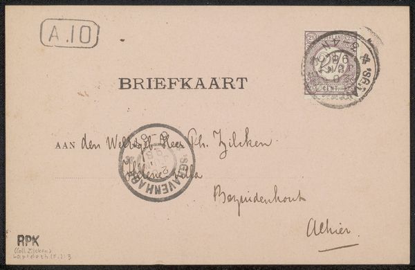
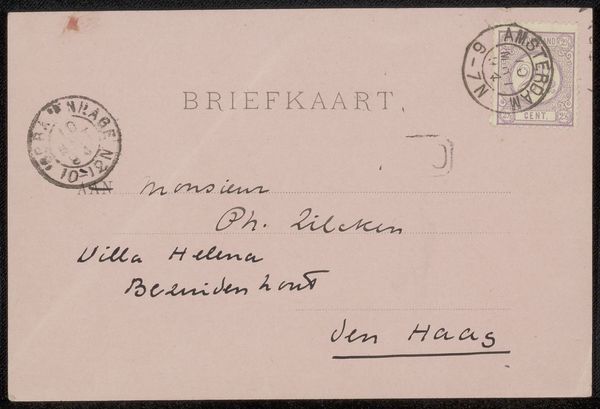
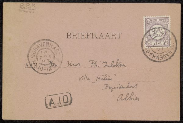
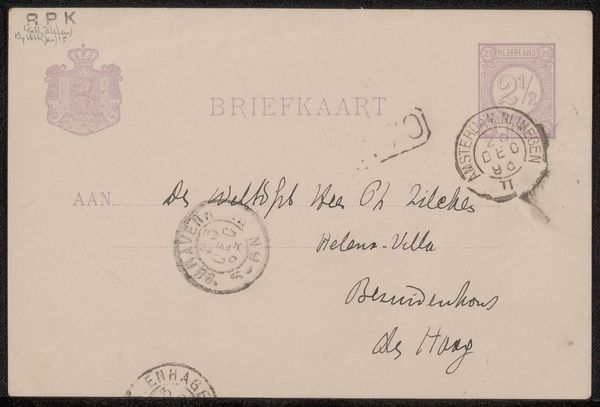
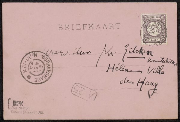
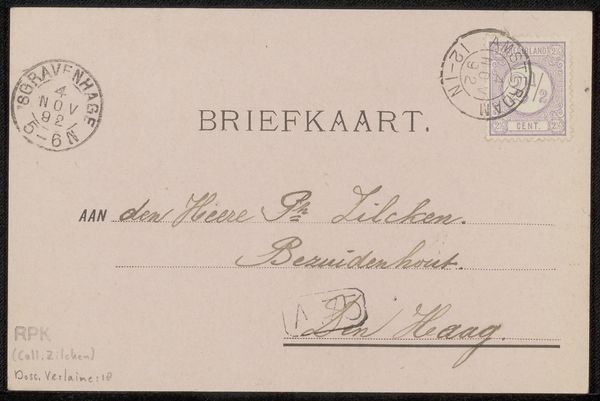
Editor: Here we have "Briefkaart aan Jan Veth" (Postcard to Jan Veth) made before 1897, using pen and ink, by Antoon Derkinderen. It appears to be a casual correspondence; almost ephemeral. What are your initial impressions? How do you interpret the artistic elements at play? Curator: My focus immediately goes to the linework. Observe the contrast between the printed "BRIEFKAART," a rigidly constructed sans-serif typeface, and the cursive script employed for the handwritten message. Note the subtle variations in pressure applied to the pen, creating a dynamic interplay between thick and thin strokes. It gives rhythm. Editor: I see, the calligraphy itself carries expressive weight beyond the literal words. Do the placement of the stamps or the postmarks contribute anything formally? Curator: Precisely. They function as visual interruptions, fracturing the uniformity of the paper’s surface. Their circular forms contrast sharply with the rectilinear structure of the printed text, and introduce an element of chance. This complicates the surface; denying simple aesthetics in favor of complexity. Derkinderen seems concerned with disrupting easy cohesion. How do you read this element? Editor: The fragmentation does draw attention to the surface itself. I initially thought it a mere functional object, but now I am more attuned to how Derkinderen turned it into something aesthetically active. Thanks for this fresh perspective! Curator: And you, for noticing how the functionality gives way to art.
Comments
No comments
Be the first to comment and join the conversation on the ultimate creative platform.