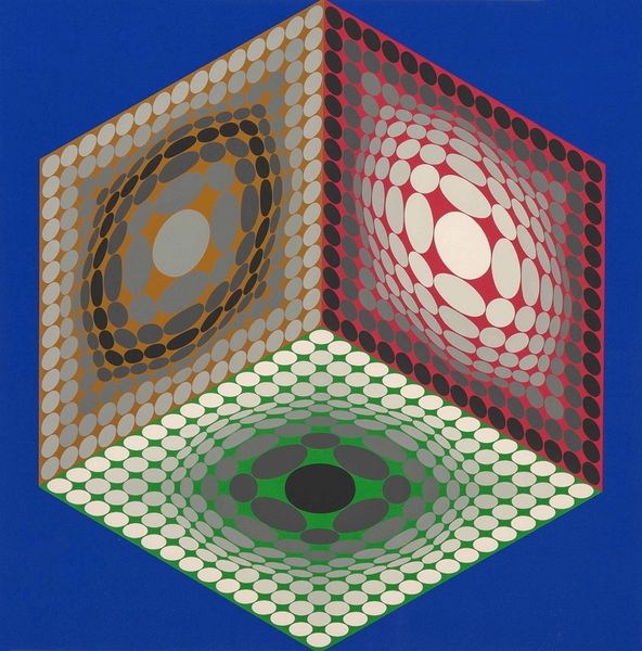
acrylic-paint
#
op-art
#
acrylic-paint
#
geometric
#
abstraction
#
modernism
Copyright: Modern Artists: Artvee
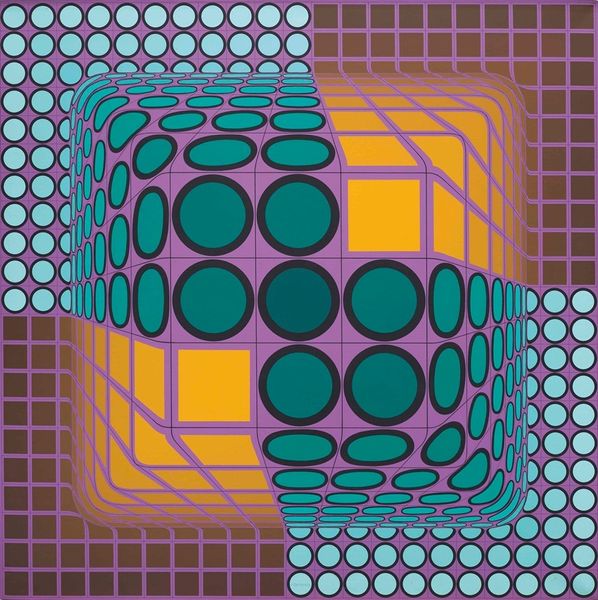
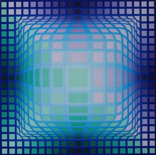
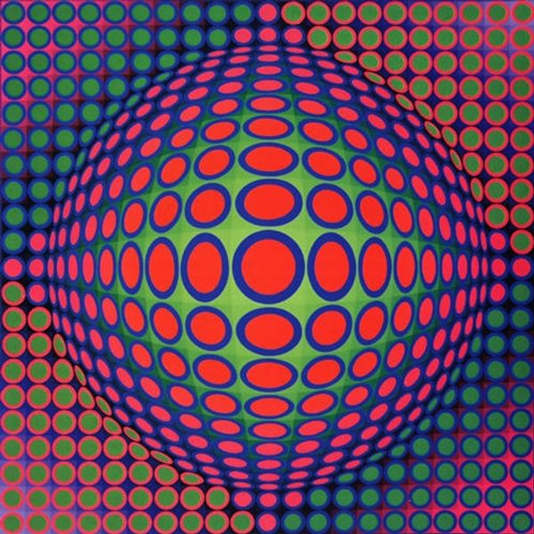
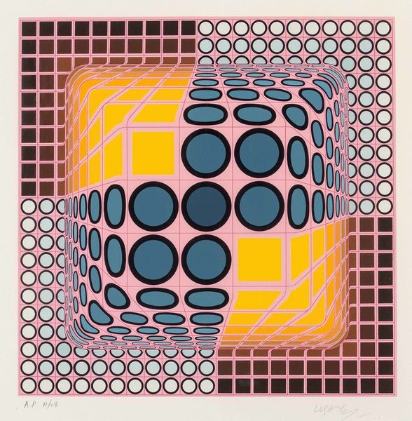
Editor: So here we have Victor Vasarely’s "TA-MA," painted in 1977 using acrylic. The piece has this intense optical illusion vibe going on, almost dizzying, especially with the grid patterns shifting into these bulging shapes. What's your take on this piece? What catches your eye? Curator: Well, "TA-MA" zings right into that late Modernist buzz, doesn’t it? Makes me think of record sleeves from my youth! Vasarely, see, he's messing with perception, pulling at the threads of our visual expectations. It's more than just squares and circles; it's a philosophical joke about how we see – or rather, how we *think* we see. Do you feel pulled into that green cube, or kept at a distance by it? Editor: I feel a little pulled in and repelled at the same time! Like my eyes can’t quite focus on whether it's coming toward me or receding. And what about the colors? Are they significant or more about the optical effect? Curator: Colors sing different songs for each viewer, don't they? But knowing Vasarely, I’d say he wasn't choosing those greens and yellows at random. They amplify the sensation, push that illusion even harder, practically daring your brain to figure it all out. He liked the grid—but then warped it, pushed it, teased it, as if it were Silly Putty! It's rigid, but elastic. Paradoxical, wouldn’t you say? Editor: Absolutely paradoxical! I'm starting to see it as less of a dizzying image and more of a playful experiment with our senses. Curator: Precisely! He wanted you to play. Now tell me, does it change how you feel about it, understanding that Vasarely had such playful intention? Editor: Totally! It makes me appreciate the artistry in tricking the eye. Thanks! Curator: The pleasure's mine. It always tickles me pink to share space with Victor’s wonderful games.
Comments
No comments
Be the first to comment and join the conversation on the ultimate creative platform.
More like this