graphic-art, print, paper, typography, engraving
#
portrait
#
graphic-art
# print
#
paper
#
11_renaissance
#
typography
#
northern-renaissance
#
engraving
#
historical font
Dimensions: height 274 mm, width 173 mm
Copyright: Rijks Museum: Open Domain
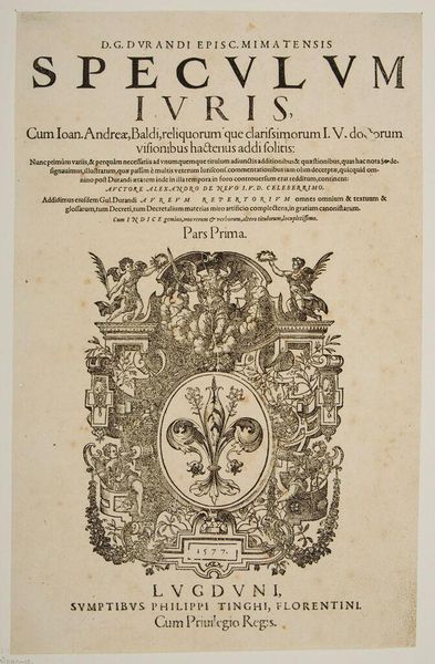
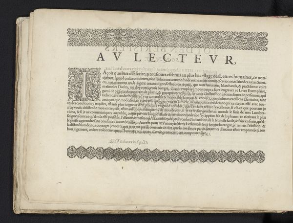
Curator: The stark contrast in this print really catches my eye; it's so formal, almost imposing. What are we looking at exactly? Editor: This is a title page for a publication by André Tiraqueau, dating back to 1535. It is crafted from paper utilizing engraving and typography techniques, placing it squarely in the realm of graphic arts. Curator: Given that, it's remarkable how much the page itself becomes an object. The visual weight is very intentional. The architecture framing the text--those columns, the medallions--suggest a constructed reality around the knowledge being presented. Are these typical elements for title pages from this period? Editor: Precisely. The architectural frame would have added considerably to the cost of production and to the prestige of the printed work. Notice too, the prominent printer's mark; such markers offered insight into the complex labor and craft involved in creating these books and, consequently, fueled their consumption. Curator: That makes sense. And the text itself? It looks like Latin. Do we know the subject of the publication? Editor: Indeed. From what is discernible, Tiraqueau’s work touches upon matters of law, familial affection, and social order, reflecting Renaissance humanism’s revival of classical learning integrated into contemporary life. It reflects an intense concern for interpreting and codifying legal and social customs, further evidenced by that 'Cum Gratia & Privilegio' – indicating legal permission to print and distribute. Curator: So, it's both a declaration of intellectual property and a contribution to public discourse. Considering the role of printed materials in disseminating new ideas, I find myself wondering who would have commissioned or consumed a publication like this in 16th-century Paris. The use of images alongside typography points to the evolution of visual communication. Editor: It really encapsulates that transformative period, bridging scholarly traditions with burgeoning print culture. I come away with a better understanding of not only Renaissance publishing practices but also of how the material form shaped the intellectual reception of this work.
Comments
No comments
Be the first to comment and join the conversation on the ultimate creative platform.
More like this