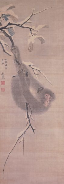
#
imaginative character sketch
#
fantasy illustration
#
curved letter used
#
possibly oil pastel
#
underpainting
#
pastel chalk drawing
#
watercolour bleed
#
watercolour illustration
#
fantasy sketch
#
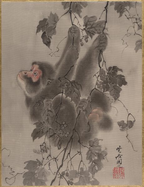
watercolor
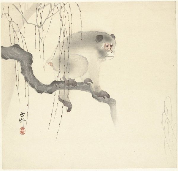
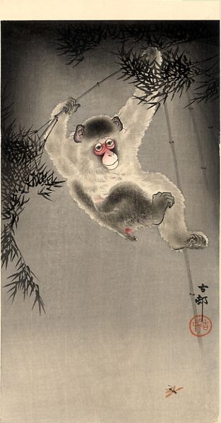
Dimensions: height 240 mm, width 250 mm
Copyright: Rijks Museum: Open Domain
Curator: Here at the Rijksmuseum, we have Ohara Koson's "Aap op boomtak," created sometime between 1900 and 1930. What's your initial impression? Editor: Well, the subdued palette creates a quiet, melancholic mood. The composition, with the monkey perched so deliberately on the branch, draws the eye immediately. Curator: The artist uses primarily watercolor, employing delicate bleeds to create soft textures, notably for the monkey’s fur. What strikes me is how Koson masterfully orchestrates depth through the use of layered washes, building a clear visual hierarchy from foreground to background. Editor: From a material perspective, you see an interesting confluence of high and low techniques. The watercolor, often associated with amateur art, is elevated by Koson’s mastery, challenging established hierarchies. Consider how accessible watercolor would have been compared to oil paint at that time. This informs the subject matter itself; is Koson interested in elevating the commonplace observation of the natural world? Curator: Certainly. We can't ignore the semiotic weight carried by the motif of the monkey. In East Asian art, monkeys are frequently symbols of mischief and cleverness. Placed amidst the weeping willow, what does it connote to you? Editor: The choice of a weeping willow adds a layer of sadness, reflecting, perhaps, the precariousness of the animal's existence within an ever-changing environment or perhaps, simply loneliness? The monkey's contemplative pose only strengthens the sentiment. Curator: The tension lies precisely in the confluence of these signifiers, challenging a singular, fixed interpretation. Koson gives us much to think about in a deceptively simple composition. Editor: It’s amazing to see how technique and choice of common materials intersect to offer nuanced cultural insight and emotive resonance. Thank you for walking me through that!
Comments
No comments
Be the first to comment and join the conversation on the ultimate creative platform.
More like this