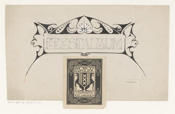
Omslagontwerp voor: Programma van het Concertgebouw Amsterdam 1918
0:00
0:00
richardnicolausrolandholst
Rijksmuseum
graphic-art, print, linocut, poster
#
graphic-art
#
art-nouveau
# print
#
linocut
#
landscape
#
figuration
#
linocut print
#
symbolism
#
decorative-art
#
poster
Dimensions: height 388 mm, width 530 mm
Copyright: Rijks Museum: Open Domain
Editor: Here we have Richard Nicolaüs Roland Holst's cover design for the Amsterdam Concertgebouw program, made in 1918. It's a linocut print, very much in the Art Nouveau style. I find the imagery quite intriguing, almost dreamlike, yet something about it feels…structured. What do you see in this piece, especially concerning the relationship between the figures and the framing devices? Curator: The framing is fascinating. Notice how the artist employs a visual vocabulary steeped in symbolism. The lute player calls to mind the tradition of Orpheus, lulling the wild beasts—the very embodiment of primal emotions-- into tranquility through music. The dancing figure with his horn introduces an element of Dionysian revelry. Editor: So, a balance between Apollonian order and Dionysian chaos? Curator: Precisely. And the "PROGRAMMA CONCERTGEBOUW" inscription woven into the design serves as more than just text; it becomes part of a symbolic heraldry, suggesting music's power to ennoble and structure experience. Editor: And Amsterdam written at the bottom…grounding it, somehow? Curator: Indeed. But note the curious, almost fantastical interpretation of native wildlife contained within the heraldic shield; The fox, bear, and fish might symbolize a harmonic consonance that is found in Dutch culture between society, culture, and natural abundance. Don't you think? Editor: I do. I didn't catch that at first. It's like Roland Holst is using visual metaphors to create a holistic emblem for Amsterdam’s musical identity. Curator: He’s reminding us that cultural memory, especially through art, is constantly being reinterpreted and reshaped to make something both old, and excitingly new. Editor: I see what you mean! It's far more complex than just a concert program cover; it's a cultural statement.
Comments
No comments
Be the first to comment and join the conversation on the ultimate creative platform.
More like this