#
aged paper
#
toned paper
#
homemade paper
#
ink paper printed
#
parchment
#
old engraving style
#
thick font
#
golden font
#
historical font
#
columned text
Copyright: Rijks Museum: Open Domain
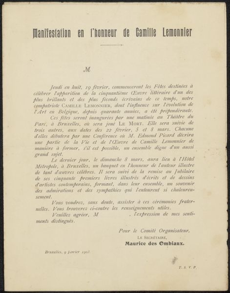
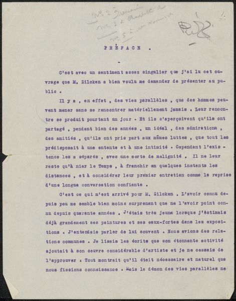
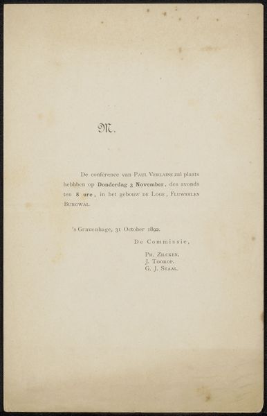
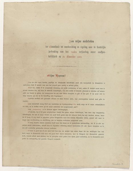
Curator: Before us, we have what’s titled "Overlijdensbericht aan Philip Zilcken," which translates to "Obituary to Philip Zilcken," likely dating back to 1892. It's part of the Rijksmuseum collection. Editor: My first impression is that this image has a starkness to it, but I like how a simple death announcement carries so much weight and artistic detail. It's aged paper printed with what appear to be some particularly strong fonts and well defined columns of text. I can't help wondering if that was meant to soften the blow? Curator: Formally speaking, its presentation adheres to particular structural conventions. Note the careful framing, and the employment of differing fonts to establish a visual hierarchy within the textual space. Editor: Absolutely, a visual framework for mourning, of sorts. You have these bold, somewhat assertive font choices for names and titles, contrasted by a more restrained typeface in the body of the message. Do you get the sense this obituary could say something deeper about status, about commemorating legacy? Curator: Indubitably. Consider the enumerated titles of the deceased— "Ridder van de Eikenkroon," "Lid van de Koninklijke Academie," indicating significant societal standing. Each designation reinforces a particular identity. Editor: Yes! I see it now, less about the loss, more about publicly recognizing one’s position. The detailed description is all about impact and recognition, while I wonder what Zilcken actually *felt* on a daily basis. The human essence sometimes fades, right? Curator: Perhaps the rigid formality inherently mutes subjective emotionality; a cultural preference, it’s quite interesting, isn't it? The materials chosen: ink on paper—simple, ubiquitous and in agreement with the gravitas required of the topic Editor: Absolutely; materials aligning perfectly with intent. All the lettering itself looks like something pulled out of a fairytale. I like the sense of layers here. The obvious death part—sure, that’s big, and right on the page—but the second death, the deeper death that comes when everything that makes someone human goes into the dark. This feels intentional in the execution. Curator: I agree, that this study presents intriguing aspects related to both its immediate and less apparent implications.
Comments
No comments
Be the first to comment and join the conversation on the ultimate creative platform.
More like this