daguerreotype, photography
#
portrait
#
daguerreotype
#
archive photography
#
photography
#
historical photography
#
romanticism
Copyright: Public Domain
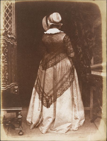
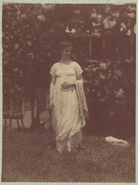
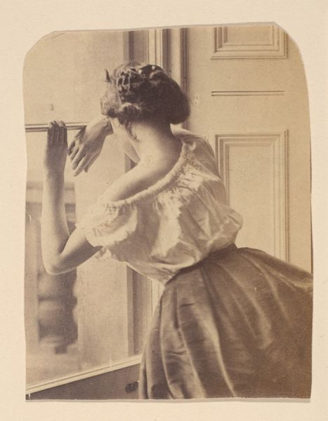
Editor: This is "Lady Ruthven," a daguerreotype made between 1843 and 1847 by Hill and Adamson. The muted sepia tones and the woman’s pose create a very mysterious atmosphere for me. What aspects of its visual composition stand out to you? Curator: The most compelling feature is the strategic arrangement of forms within the frame. Note how the sitter’s back is presented. She occupies the pictorial space but turns away. The texture created by her garment and lace shawl also provide contrasting densities within the monochromatic scheme. Do you observe how the frame almost bisects the photograph, and creates asymmetrical distribution of forms? Editor: I see it. The patterned curtain on the left balances with the dark wall on the right. Does that framing contribute to the portrait's overall mood? Curator: Precisely. The darker wall draws our attention back towards Lady Ruthven and the ornate side table; this reinforces the subject's relation to luxury and taste. This structural detail, along with the tonal subtleties of the daguerreotype process, contribute to the image’s impact. Consider the deliberate placement and their functions in activating our visual experience. The question for me becomes one of intention, a game of contrasts. Do the artists want to foreground Lady Ruthven or make her blend in? Editor: I guess I had not thought of the power of contrasts when looking at such an old photo, but your analysis makes me think that they add depth and mood. Thank you for broadening my perspective! Curator: You're welcome! Reflecting on compositional decisions can reveal deeper meaning and artistry in a work, even within a seemingly simple portrait.
Comments
No comments
Be the first to comment and join the conversation on the ultimate creative platform.
More like this