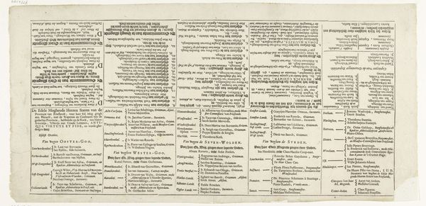
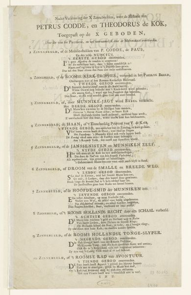
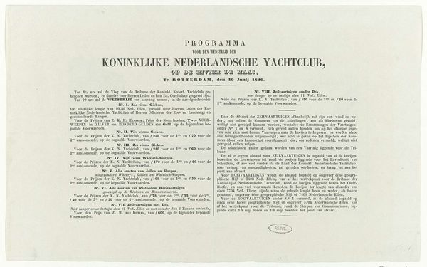
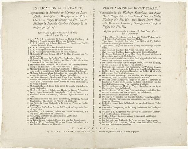
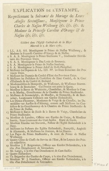
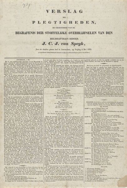
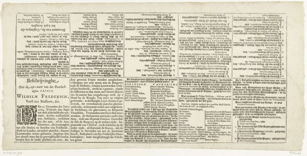
Tekstblad bij de prent van het vertrek van Willem III naar Engeland en aankomst aldaar, 1688 1689
0:00
0:00
jacobusrobijn
Rijksmuseum
print, paper, typography
#
dutch-golden-age
# print
#
paper
#
text
#
typography
#
newspaper layout
Dimensions: height 265 mm, width 575 mm
Copyright: Rijks Museum: Open Domain
Curator: Here we have "Tekstblad bij de prent van het vertrek van Willem III naar Engeland en aankomst aldaar, 1688," or, "Text Sheet with the Print of William III's Departure to England and Arrival There," made in 1689 by Jacobus Robijn. It’s a fascinating example of early printed news. What’s your first reaction? Editor: Overwhelming! It feels like confronting a wall of meticulously ordered text. The density alone speaks to the era's hunger for information, presented with an almost bureaucratic intensity. It’s fascinating, in an information-overload kind of way. Curator: It's printed on paper, showcasing the typography skills of the Dutch Golden Age. The layout reminds me of a meticulously designed newspaper. It aimed to inform the public about a pivotal moment: William III's voyage to England. But what does it *mean*, do you think? Editor: Symbols aren't overt here; instead, the text itself becomes symbolic. The ordered columns, the exhaustive lists... it reflects a culture obsessed with control and record-keeping, even in times of monumental change. The very act of naming every captain and ship transforms a chaotic historical event into something manageable, comprehensible. Almost…official. Curator: Exactly! This text meticulously details the captains, ships, crew, and artillery involved. Imagine the public's desire for every last detail! There's a weight of cultural memory imbued in these words; almost a communal holding of breath. Editor: Yes, you're right, it's like a proto-news feed etched onto paper. It has this odd dual function: documenting history while simultaneously attempting to shape its narrative through the sheer weight of supposed fact. It’s not about storytelling so much as information aggregation as validation. And those long, unbroken paragraphs – a challenge to today’s fragmented attention spans. It speaks volumes about the patience, and perhaps the priorities, of the era. Curator: I find the almost clinical presentation quite powerful; the emotional impact comes from sheer data! A contrast to the flowery, romanticised narratives of later historical accounts. There's almost something defiant about the plainness. Editor: I agree! It's easy to overlook such textual artifacts amid grand paintings, but this piece reminds us that history often unfolded in the details. And now, I think I actually *do* know all the names of every single sailor on that crossing... Not really, but I now I understand how people did. Curator: It highlights a period that prized literacy and documentation – not just the 'great' events but every nitty-gritty detail. A nice change, and beautifully captured on paper.
Comments
No comments
Be the first to comment and join the conversation on the ultimate creative platform.
More like this