graphic-art, print, textile, woodcut
#
graphic-art
# print
#
pen illustration
#
textile
#
figuration
#
expressionism
#
woodcut
#
line
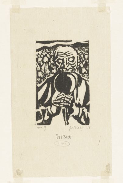
Dimensions: height 342 mm, width 228 mm
Copyright: Rijks Museum: Open Domain
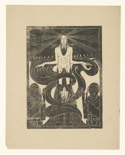
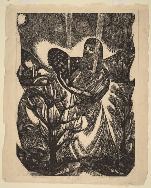
Editor: We’re looking at "Man bij kanon," a woodcut made between 1888 and 1945 by Chris Lebeau. The high contrast of the black ink on the pale paper really strikes me. There’s a figure with their hands clasped, next to a cannon, and some rather expressive lines. It feels very graphic and intentional. How do you interpret this work? Curator: Note how Lebeau orchestrates our vision. The composition’s strength stems from the stark contrast of black and white. Observe the meticulous carving, how each line contributes to the overall structure, defining forms and creating textures. The interplay of solid black areas and the fine white lines is especially compelling; what feeling does this arrangement of visual elements evoke? Editor: I think it creates a sense of tension, like the calm before a storm. Or maybe even during one. The figure’s posture is serene, but the cannon is anything but. I wonder if it's an intentional juxtaposition. Curator: Precisely! The intentionality is revealed in the formal relationships. Reflect on how the verticality of the figure is echoed in the explosion emanating from the cannon. Semiotically, how might we decode the figure’s pose and placement relative to the aggressive force of the cannon? Could Lebeau be commenting on power structures, the individual versus destructive technologies? Editor: That’s a great point, about power. And you can really see that through the use of lines! Curator: Indeed. Through line and form, Lebeau presents us with a powerful, if unsettling, visual statement. These elements provide a pathway to understand the underlying intent. Editor: I’ve definitely learned how much the formal elements contribute to its overall impact. Thanks for highlighting those techniques.
Comments
No comments
Be the first to comment and join the conversation on the ultimate creative platform.
More like this