lithograph, print
#
portrait
#
magazine format
#
narrative-art
#
dutch-golden-age
#
lithograph
# print
#
landscape
#
figuration
#
line
#
symbolism
#
cityscape
#
realism
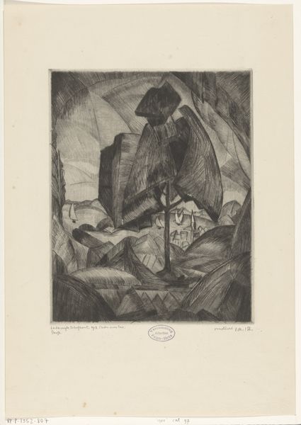
Dimensions: height 475 mm, width 315 mm
Copyright: Rijks Museum: Open Domain
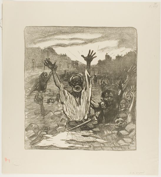
Willy Sluiter made this print, "Het licht uit Rusland" or "The light from Russia," to be a cover for a Dutch weekly magazine. It's all lines, lines, lines, isn't it? A bit like handwriting, the artist feels present and alive. Look at how Sluiter contrasts the heavy, scratchy shading of the soldiers and trenches with the light, almost glowing words "VRYHEID," "REVOLUTIE," and "DEMOCRATIE." The yellow ink feels less like a color and more like a metaphor. I guess the artist wants us to feel that these ideas are meant to illuminate the scene. The figures themselves are built up from very simple strokes, but you can really feel the weight of their helmets and the texture of their uniforms. I’m drawn to the little details, like the barbed wire in the distance. There's something about the contrast between the harshness of the war and the idealism of the words that feels both powerful and a bit unsettling. Think of Otto Dix for a similar mood, or perhaps George Grosz. Art is always in dialogue with other art, isn't it? It's up to us to listen.
Comments
No comments
Be the first to comment and join the conversation on the ultimate creative platform.
More like this