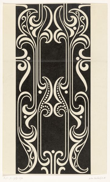
print, typography, engraving
#
pen drawing
# print
#
form
#
typography
#
line
#
engraving
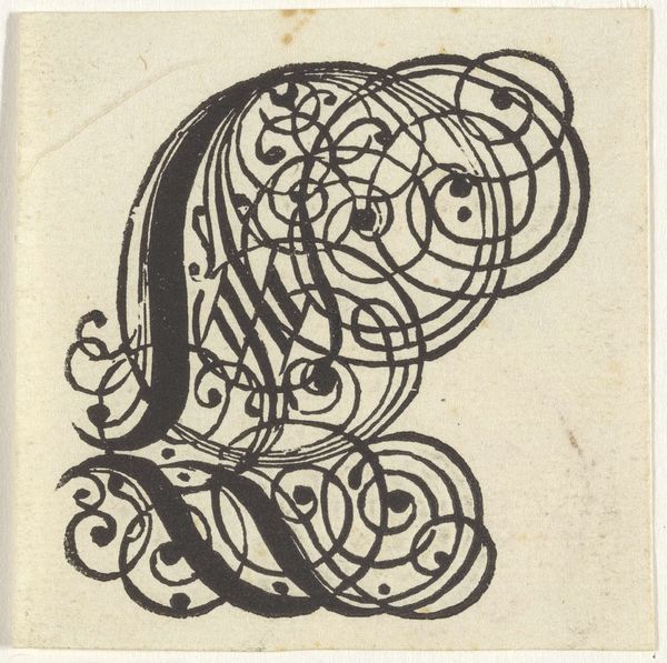
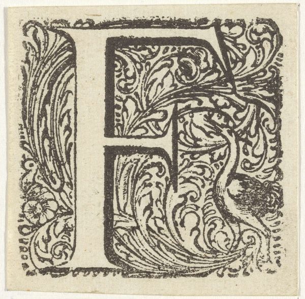
Dimensions: height 57 mm, width 67 mm
Copyright: Rijks Museum: Open Domain
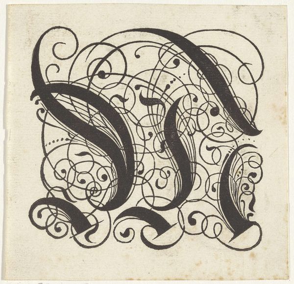
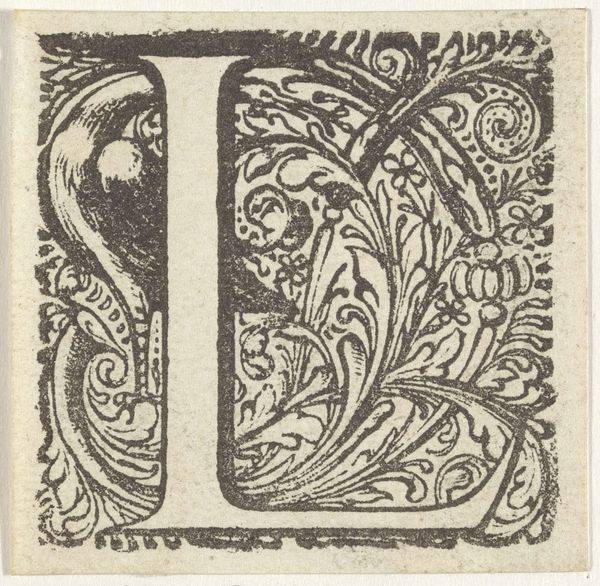
Editor: So, this is “Letter M,” a 17th-century engraving by an anonymous artist. It's fascinating how something as simple as a letter can be turned into such an ornate design. What symbols do you see embedded within the lines of this image? Curator: The letter “M” itself acts as a potent symbol. Throughout history, initials, monograms, and emblems represented personal or collective identity, acting almost as talismans. Consider how heraldry or royal cyphers functioned, investing a name, a family, a lineage with power and memory. Does this particular “M” evoke any specific feelings or historical periods for you? Editor: I see the swirling lines as both elegant and somewhat restrained, maybe reflective of its era. I wonder if the anonymous artist intentionally incorporated these particular curves? Curator: Absolutely. Those aren’t just decorative flourishes. Swirls, curves, and interwoven patterns can signify infinity, interconnectedness, and the continuous flow of life. The 'M' appears to transform into a vessel brimming with symbolic possibility; consider that in contrast to simpler, cleaner sans-serif forms. What psychological effect might these ornate, somewhat burdened shapes have? Editor: That’s a perspective I hadn’t considered. It does feel… heavier, perhaps even burdened. A stark contrast to modern, minimalist typography. Curator: Indeed! The cultural memory embedded in visual forms speaks volumes. Now, compare this to a simple ‘M’ on a phone screen. How much history is lost – or gained – through that transition? Editor: This really illuminates how much meaning can be packed into something as commonplace as a letterform. It challenges my assumptions about the supposed neutrality of typography. Curator: Precisely! It highlights the continuing power of symbols, and our perpetual reinvention of their meanings through time.
Comments
No comments
Be the first to comment and join the conversation on the ultimate creative platform.
More like this