drawing, paper, ink, pen
#
portrait
#
drawing
#
hand-lettering
#
narrative-art
#
hand drawn type
#
hand lettering
#
paper
#
personal sketchbook
#
ink
#
hand-drawn typeface
#
ink drawing experimentation
#
pen-ink sketch
#
pen work
#
sketchbook drawing
#
pen
#
sketchbook art
#
modernism
Copyright: Rijks Museum: Open Domain
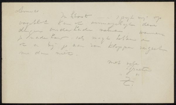
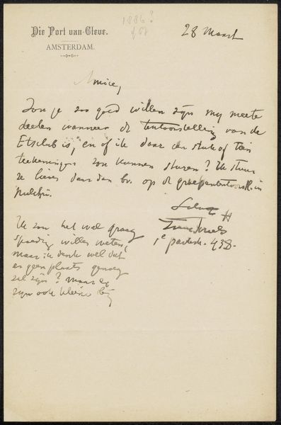
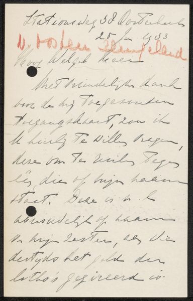
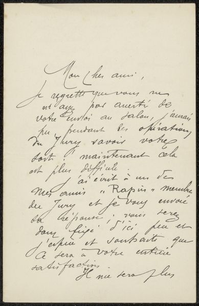
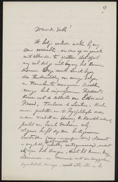
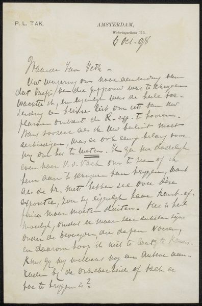
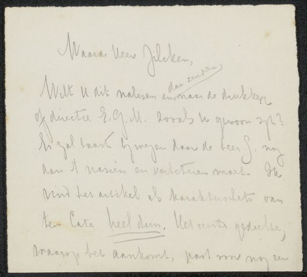
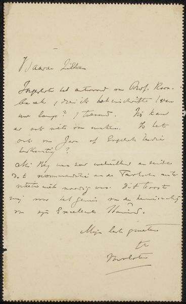
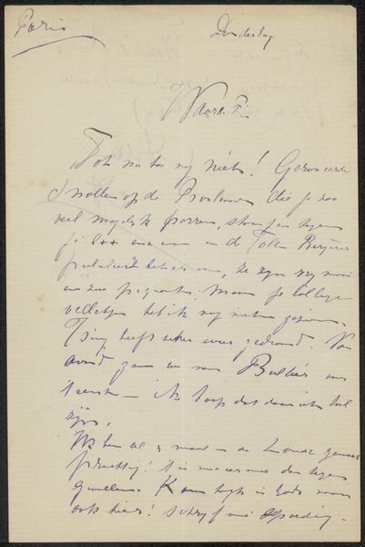
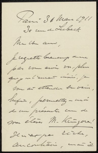
Curator: This work, "Briefkaart aan Philip Zilcken" which translates to Postcard to Philip Zilcken, is a drawing done by Jan Hoynck van Papendrecht, likely between 1911 and 1931, using pen and ink on paper. The script is flowing, with varying line weights. It seems more a study of hand-lettering. Editor: My initial impression is of controlled chaos. The handwriting is dense and energetic, yet the overall composition feels balanced. There's a dynamic tension between the form of the letters and their legibility. The thin, almost frail paper ground makes a good juxtaposition to the boldness of the letters. Curator: The work clearly reflects a period fascinated by communication. We see not just the message, but the craft of delivering it – a handmade alternative to print. Paper, ink, and the hand all contribute to a piece of material culture and its connection between individuals within the creative circles of its time. Editor: True, but on the formal level, observe how the loops and lines interact. Hoynck van Papendrecht treats the surface as a field for gestural exploration, building layers of texture and contrasting values through the manipulation of pressure and speed in the pen strokes. The text serves as a skeleton to distribute the dark ink almost organically. Curator: That materiality points toward an aesthetic interest and the means of creating that aesthetic in hand. The act of sketching correspondence highlights a specific historical moment when hand-written notes carried social and economic capital now translated into something different via modern channels. It's this historical significance embedded in ordinary acts that interests me. Editor: From my perspective, it's interesting to appreciate it as a self-contained exercise in visual rhythm and balance. Meaning, while important, gives way to a focus on texture, the contrast between thin and thick lines, and the overall effect of the artist's marks on a relatively limited picture plane. I think that gives the drawing strength. Curator: Understanding the process illuminates a fascinating relationship to craft and context, but I can agree about its striking textural character that the artist conveys effectively. Editor: It certainly provides food for thought when assessing a piece like this in terms of pure form and materiality.
Comments
No comments
Be the first to comment and join the conversation on the ultimate creative platform.
More like this