drawing, paper, ink
#
portrait
#
drawing
#
paper
#
ink
#
calligraphy
Copyright: Rijks Museum: Open Domain
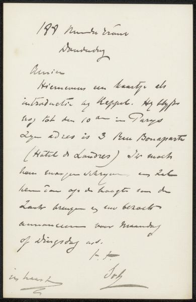
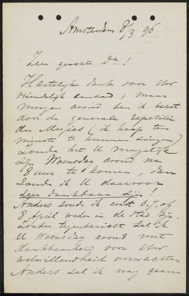
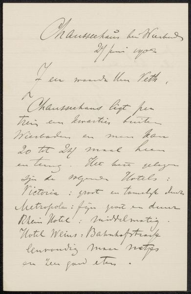
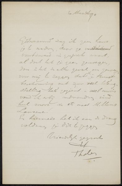
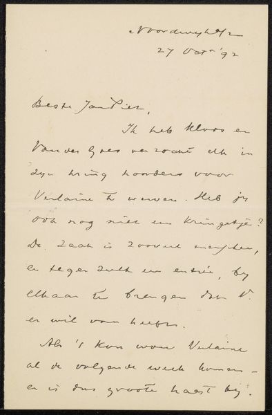
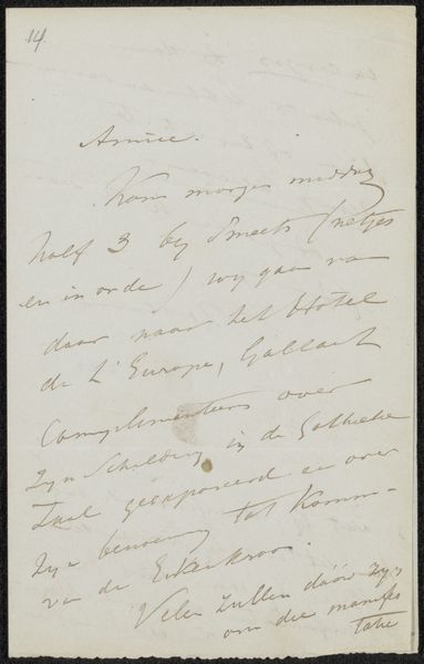
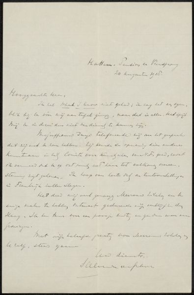
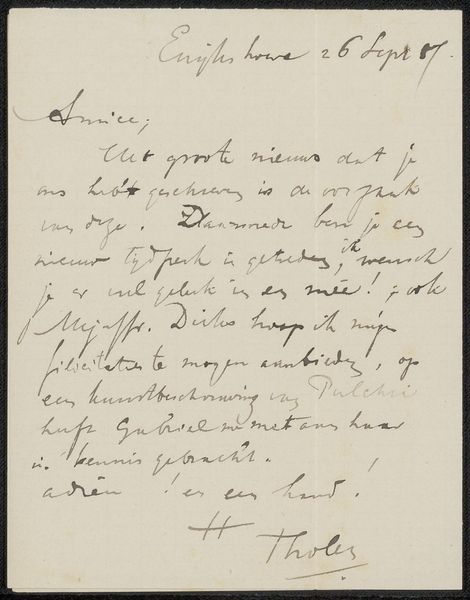
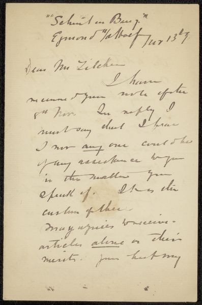
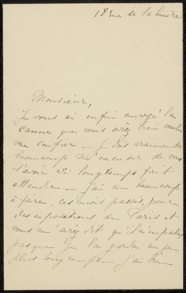
Editor: This is "Brief aan Philip Zilcken," possibly created between 1911 and 1931 by Joseph Hollman. It's an ink drawing on paper. The writing, or maybe calligraphy, gives the artwork an intriguing visual texture. What catches your eye in this piece? Curator: The dynamism inherent in the lines themselves commands my immediate attention. The looping ascenders and descenders create a spatial rhythm, a dance across the page that transcends mere legibility. Note the carefully considered weight and stroke of the pen, how each character contributes to a structured whole. What principles of design do you observe at work here? Editor: I see the consistency in the line thickness creating visual unity. There’s also contrast where the lines are bolder versus lighter, and how some sections are closely packed compared to others. It creates a varied visual texture. Curator: Precisely. We can understand the aesthetic value of calligraphy even without deciphering the text. The ink’s interaction with the paper fibers generates a tactile quality. And consider the composition overall: the considered arrangement of these linguistic forms creates a landscape of letterforms that resonates with abstract expressionist aesthetics. The structure echoes the sentiment within the missive itself. Do you think the illegible elements might add or detract from the viewing experience? Editor: I think it invites curiosity! Seeing the shapes and the flow encourages closer inspection of form rather than content. It's really shifted my perspective. Curator: Indeed. The artistry exists beyond the message itself. Viewing it has provided a deeper look at the material’s potential.
Comments
No comments
Be the first to comment and join the conversation on the ultimate creative platform.
More like this