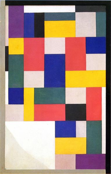
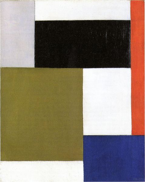
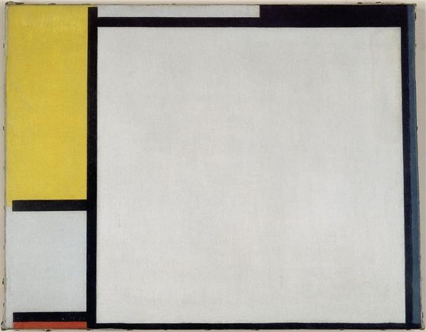
mixed-media, painting, oil-paint
#
de-stijl
#
mixed-media
#
abstract painting
#
painting
#
oil-paint
#
geometric composition
#
form
#
geometric pattern
#
abstract pattern
#
geometric
#
geometric-abstraction
#
abstract-art
#
abstraction
#
modernism
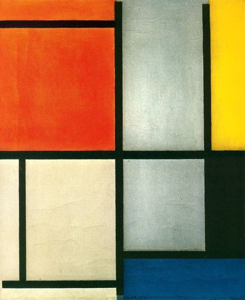
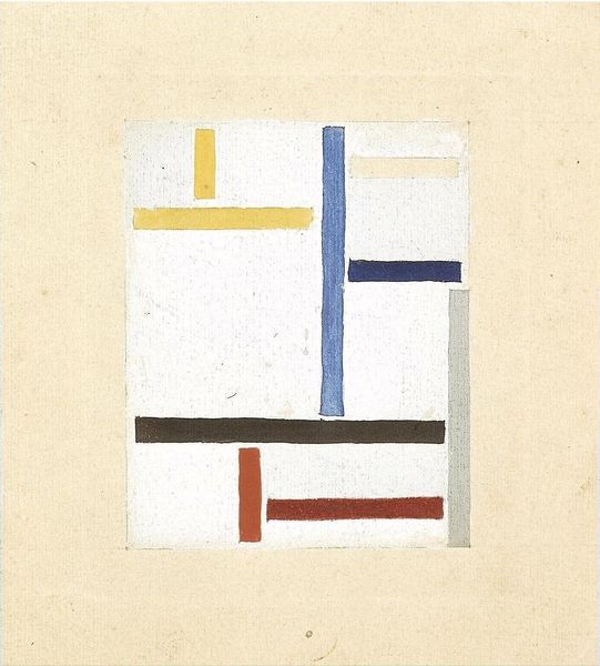
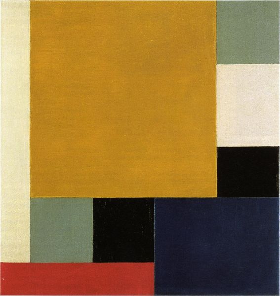
Dimensions: 35 x 35 cm
Copyright: Public domain
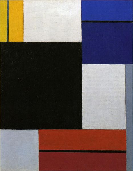
Editor: So, this is Theo van Doesburg's "Composition XVIII in three parts" from 1920. It's an oil on canvas, and I’m struck by the severe geometric order, like a series of experiments with blocks of colour. What do you see in this piece? Curator: The most immediately apparent element is the arrangement of geometric forms in primary colours. Notice how Van Doesburg limits his palette—blue, red (here rendered as orange), and the neutral tones—to create a self-contained visual system. These three discrete works push and pull at each other through compositional variation. Observe the strategic placement of lines and rectangles: how do they activate the spatial relationships within each frame? Editor: I see what you mean. The colors do feel balanced, even though the arrangements are different in each part. It is hard to look at only one as each shifts and alters when they sit side-by-side. What effect is created through this series or visual studies? Curator: Consider how these works embody De Stijl principles—a pursuit of pure abstraction through essential forms. Van Doesburg emphasizes the materiality of the painted surface, negating depth or illusion. By investigating the pictorial elements in relation to each other, Van Doesburg calls us to scrutinize not only their aesthetic qualities, but also our habits of viewing and organizing the visible world. How does the composition resonate with your understanding of spatial organization? Editor: It’s almost like the paintings are trying to show the bare minimum you need for something to be a balanced composition, even if it's not representational. I appreciate how it breaks things down to such basic elements and focuses on the purity of each colour and shape. Curator: Precisely. The strength here lies not in realistic portrayal, but in how visual fundamentals are manipulated and refined, producing an innovative interplay. This encourages a deep exploration of artistic tools for creating pictorial harmony. Editor: Right. I see it’s not just about the blocks themselves, but also the spaces between them, and how they speak to each other as a whole.
Comments
No comments
Be the first to comment and join the conversation on the ultimate creative platform.
More like this