drawing, paper, ink
#
drawing
#
paper
#
ink
#
geometric
#
abstraction
#
pop-art
#
line
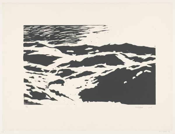
Dimensions: image: 45.7 x 60.8 cm (18 x 23 15/16 in.) sheet: 52.7 x 66.5 cm (20 3/4 x 26 3/16 in.)
Copyright: National Gallery of Art: CC0 1.0
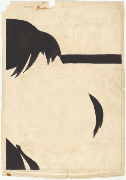
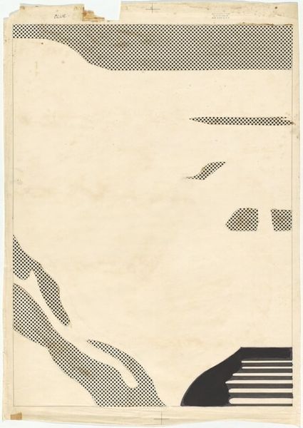
Editor: Roy Lichtenstein’s "Sunrise: Separation Drawing for Red," made with ink on paper in 1965. At first glance, it's deceptively simple - these bands of black feel graphic and quite stark. How should we interpret this seemingly minimalist composition? Curator: Well, you know, there's this quiet intensity in its bareness, isn’t there? It's a blueprint for something larger. What looks simple—geometric shapes filled with black, and that intriguing line of dots up top—is actually a critical step in Lichtenstein's printmaking. Notice the “Red” written near the color swatch. This drawing allows you to watch an artist wrestle with breaking color from form, teasing apart the mechanics of mass-produced images, one layer at a time. Isn't that fascinating? Editor: It is! I didn't immediately consider its purpose as part of a printing process. I was stuck on its flat graphic qualities. Curator: Exactly! But Lichtenstein loves these dualities, these layers of meaning. It’s got the high-art world pretensions while pointing to mass culture's printing process at the same time. The drawing is really about how images are broken down to be replicated. Can you see now how the apparent simplicity is rather a conceptual rabbit hole? Editor: Now I do. What I initially took for pure abstraction becomes this meditation on reproduction and mechanical processes. I definitely appreciate how the drawing makes you think about what goes into a "finished" product. Curator: Right? That’s what keeps drawing me back. Each of Lichtenstein's works has a complex, coded language underneath, whispering of an aesthetic balancing act. What will we discover next, I wonder?
Comments
No comments
Be the first to comment and join the conversation on the ultimate creative platform.
