1635
Franstalig voorwoord
Crispijn van de (II) Passe
1597 - 1670Location
RijksmuseumListen to curator's interpretation
Curatorial notes
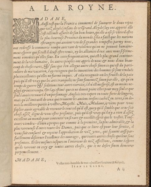
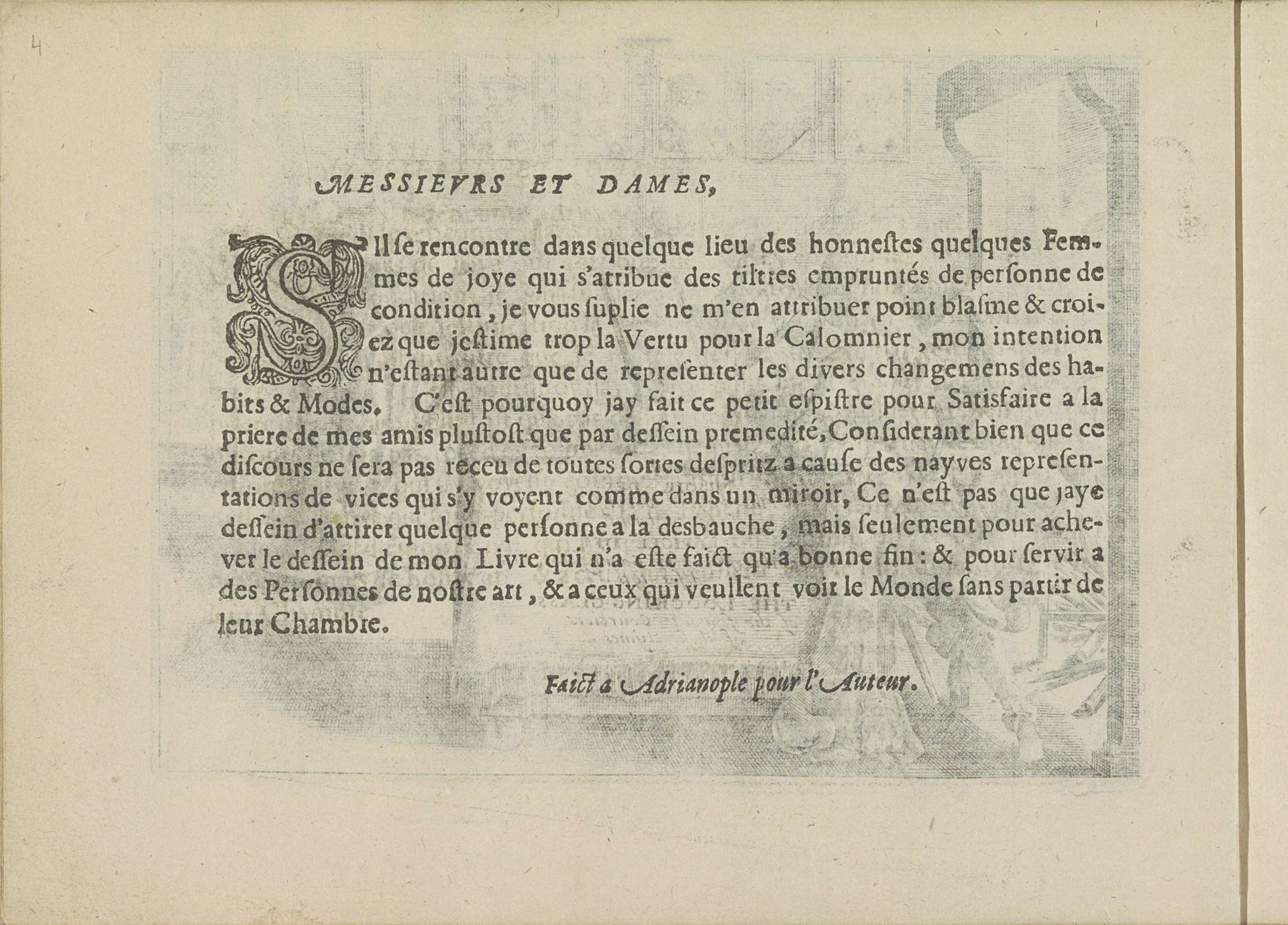
This French preface was etched by Crispijn van de Passe the Younger around the early 17th century. Immediately, one notices the composition—a tightly arranged block of text dominated by an ornate initial 'S' that marries the calligraphic with the organic. The black ink against the off-white paper creates a stark contrast, emphasizing the texture and materiality of the print. The visual structure here is not merely decorative; it invites us to decipher its underlying codes. Van de Passe uses the "S" to destabilize traditional notions of text presentation. This letter, intertwined with foliage, acts as a semiotic marker, drawing attention to the text's themes of transformation. The artist uses line and form to question fixed meanings. Note the careful balance between the density of the text and the open space around it, which creates a visual rhythm. It is not just an aesthetic choice but a strategic one. The artist asks us to consider how we read and interpret the world around us.