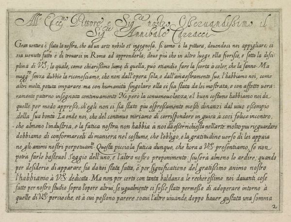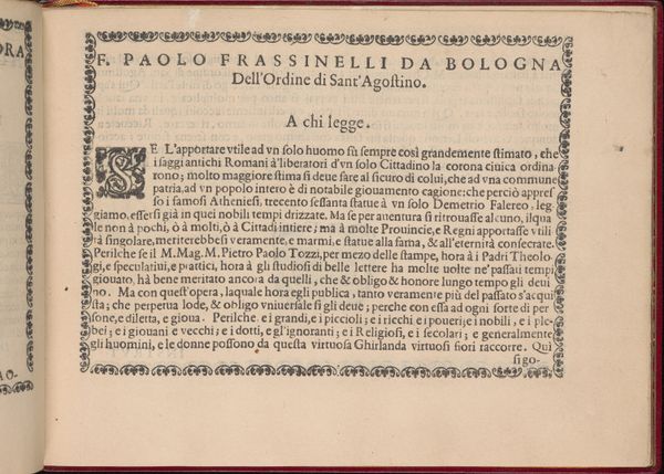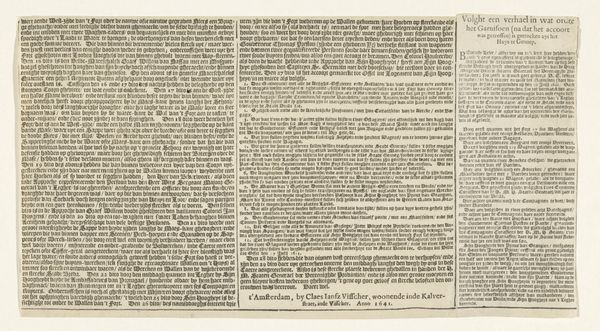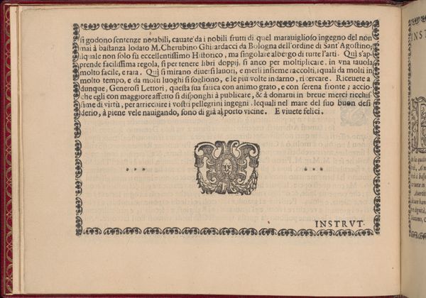
Corona delle Nobili et Virtuose Donne: Libro I-IV, page 58 (verso) 1601
0:00
0:00
drawing, print, typography
#
drawing
#
aged paper
#
hand-lettering
# print
#
book
#
hand drawn type
#
hand lettering
#
personal sketchbook
#
typography
#
hand-drawn typeface
#
fading type
#
pen work
#
sketchbook drawing
#
italian-renaissance
#
italy
#
sketchbook art
Dimensions: Overall: 5 1/2 x 7 11/16 in. (14 x 19.5 cm)
Copyright: Public Domain
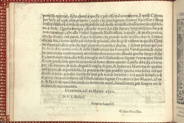
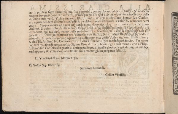
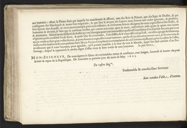
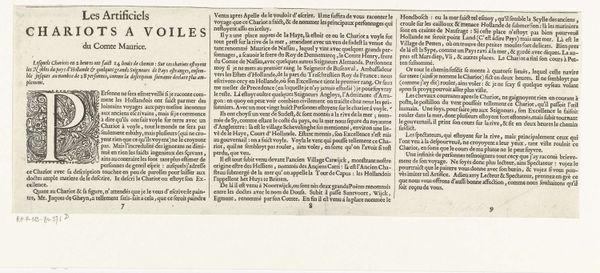
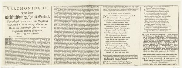
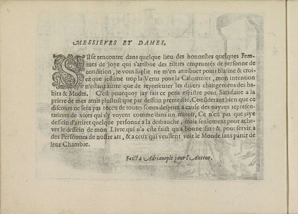
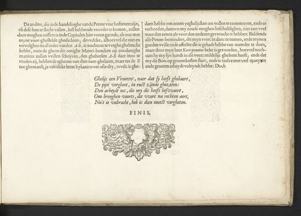
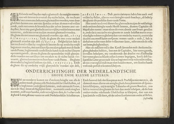
Editor: Here we have a page from "Corona delle Nobili et Virtuose Donne," a print and drawing by Cesare Vecellio from 1601, currently held at the Metropolitan Museum of Art. The aged paper and intricate typography give it a distinctly antique feel. It almost feels like I’ve stumbled upon someone's personal sketchbook. How do you interpret this work? Curator: Let us begin by considering its inherent formal elements. Note the layout: the dense text is framed by a delicate, repeating floral border at the top edge of the page. Consider also, the contrast between the formality of the typeface and the personal nature of a handwritten signature—Cesare Vecellio's own. It immediately prompts a series of structural oppositions, would you agree? Editor: I see what you mean about those oppositions! So, you're suggesting that this contrast, a tension almost, is key to understanding it formally? Curator: Precisely. It’s an artifact negotiating public presentation and personal expression. Consider the visual weight of the densely packed Italian Renaissance typeface itself; it projects authority while still presenting a highly artistic, personally rendered creation. The border, however, is not just decoration. How does it modify or soften the structural reading, would you suggest? Editor: Well, I see now that the floral element softens that severity. I mean the formal structure then isn't just a straightforward case of "text versus the border"... it is more complex in relation to how the text itself looks in its design. Curator: Indeed! These visual elements create a balanced but intriguing dialogue, presenting information and authority within a softer framework, suggesting an approachable presentation. That dialogue is something I will be certain to watch out for now. Editor: Fascinating. Thank you for providing that close analysis.
Comments
No comments
Be the first to comment and join the conversation on the ultimate creative platform.
