drawing, mixed-media, paper, ink, pen
#
drawing
#
comic strip sketch
#
quirky illustration
#
mixed-media
#
pen illustration
#
hand drawn type
#
paper
#
personal sketchbook
#
ink
#
ink drawing experimentation
#
pen-ink sketch
#
pen work
#
sketchbook drawing
#
pen
#
sketchbook art
#
calligraphy
Copyright: Rijks Museum: Open Domain
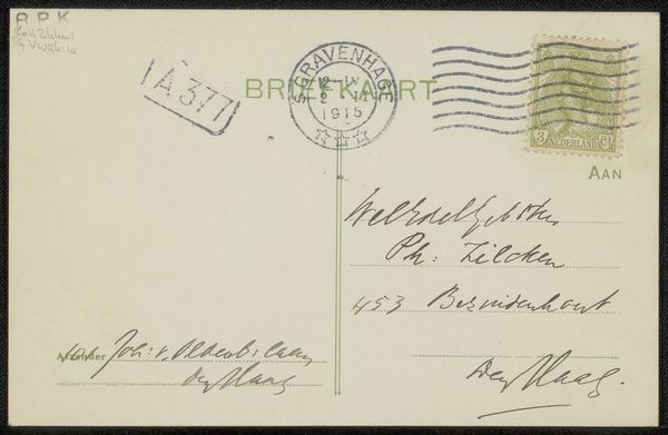
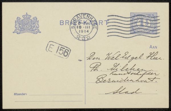
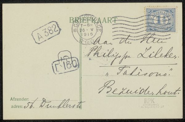
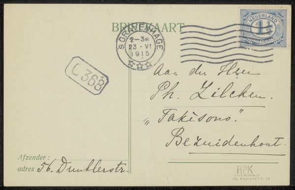
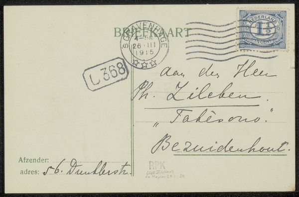
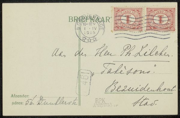
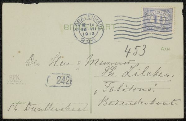
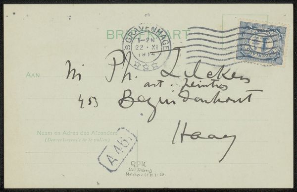
Léon Paschal made this postcard to Philip Zilcken at some unknown time, with ink on paper. The stamp and postmark have an appealing geometry, especially contrasted with the rounded, soft script that makes up the address. You can see the pressure of the pen in the varying line weights of the handwritten parts. The ink is darker where the pen lingered, almost as if the writing itself is a kind of drawing. There’s a rhythm to the hand that holds the pen, almost like a dancer improvising. The overall effect is informal and friendly, not overly concerned with perfect legibility, and all the more human for it. I think of Cy Twombly’s painterly scrawls, or even some of the text-based works by someone like Ed Ruscha. There’s a real art to something that's halfway between writing and image making.
Comments
No comments
Be the first to comment and join the conversation on the ultimate creative platform.
More like this