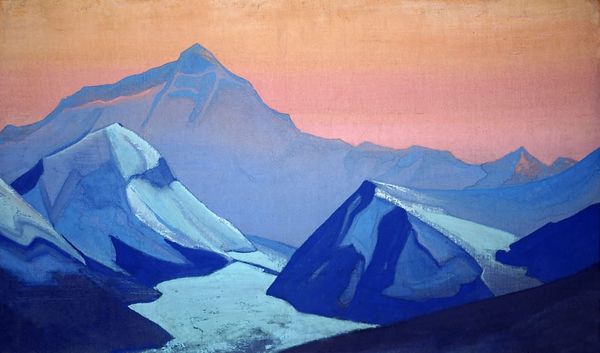
oil-paint
#
oil-paint
#
landscape
#
oil painting
#
geometric
#
mountain
#
modernism
#
realism
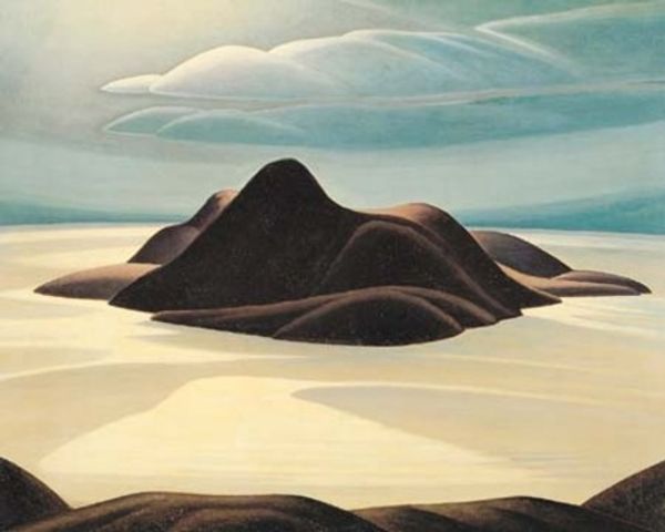
Copyright: Lawren Harris,Fair Use
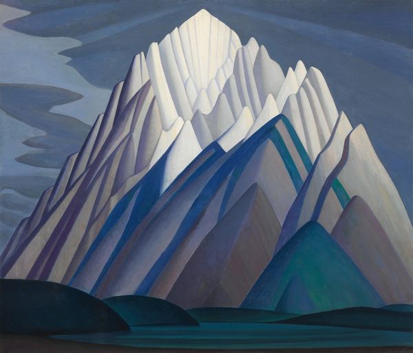
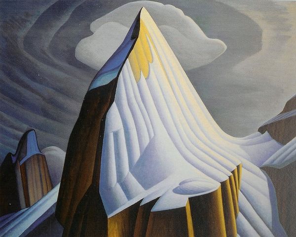
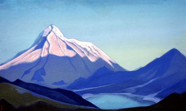
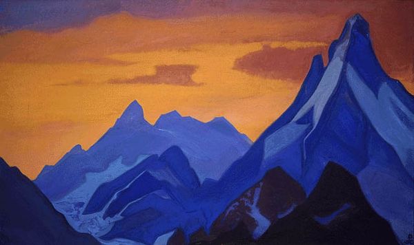
Lawren Harris made this painting of a mountain, probably using oil paint, and you can see how he’s building up the forms in these crisp, clean layers. What gets me is the paint quality – how it's mostly opaque, but thin, and the way that Harris doesn't blend things. He lets each colour sit alongside the next one. It’s almost like hard-edged abstraction, but still reads as a landscape. I love the way the ridges in the foreground are rendered with lines. The contrast between the cool colours in the foreground and the warm hues of the mountain create a lovely sense of depth. Looking at the way Harris simplifies the forms reminds me of Alex Katz. Both artists have this way of reducing things down to their essence, using a limited palette to create something that's both representational and abstract. It's a cool trick if you can pull it off.
Comments
No comments
Be the first to comment and join the conversation on the ultimate creative platform.
More like this