graphic-art, lithograph, print, paper, typography
#
graphic-art
#
lithograph
# print
#
paper
#
typography
#
cityscape
Dimensions: height 288 mm, width 381 mm
Copyright: Rijks Museum: Open Domain
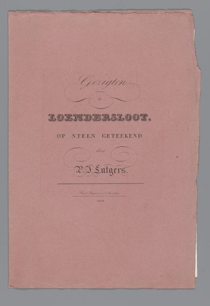
This is the cover for a series of Amsterdam towers, created by an anonymous artist using an engraving technique. Its pink background colour immediately strikes a soft, almost nostalgic tone. The composition centres on the ornate typography, where the serifs and flourished lines suggest a desire to elevate the text into a visually decorative element. The structured arrangement of the words, stacked and balanced, gives a sense of classical order, yet the varying sizes and styles disrupt any rigid formality. This interplay between structure and play hints at semiotic codes where each letterform and layout choice conveys meaning beyond the literal. Consider how the artist destabilizes the ordinary function of a book cover. The visual elements suggest deeper engagements with representation and perception. What is being framed here? Perhaps a challenge to fixed notions of urban identity, offering instead a nuanced, interpretive reading of Amsterdam’s architectural icons.
Comments
No comments
Be the first to comment and join the conversation on the ultimate creative platform.
More like this