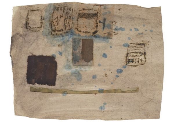
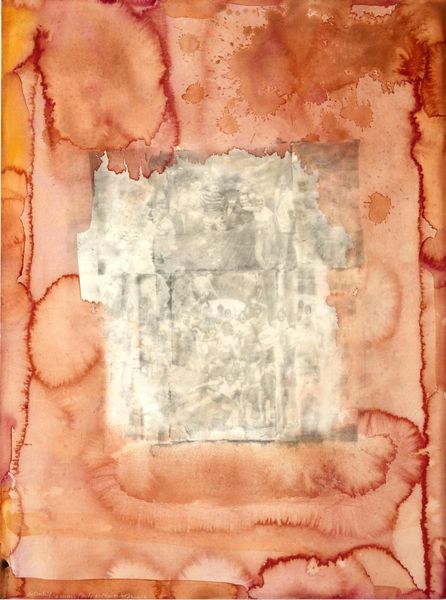
mixed-media, collage, print, textile
#
mixed-media
#
collage
# print
#
appropriation
#
textile
#
geometric
#
watercolor
Copyright: National Gallery of Art: CC0 1.0
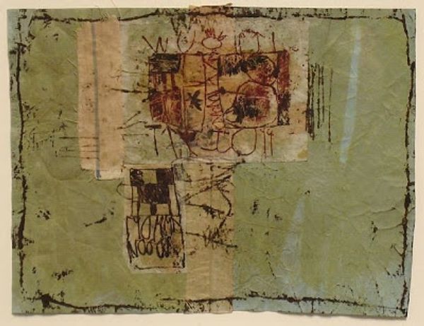
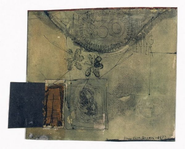
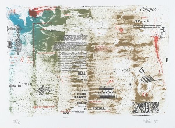
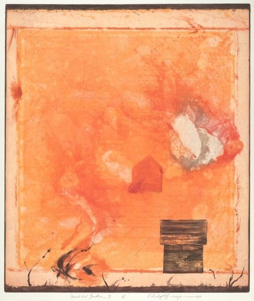
William Dole made this untitled print, using what looks like stencils and thin washes of red and beige ink. It's like he’s building up a collage of fragments. The color palette is muted but really effective, with the red creating a strong contrast to the beige. The texture of the ink is interesting, almost powdery in places, which gives it a tactile quality. Look how the forms overlap and interact: the way the rectangular blocks intersect reminds me of the grid paintings of Agnes Martin, or maybe even some early hard-edge paintings from the 60’s. I’m particularly drawn to the section with the inscription ‘Objects d’Art’—it’s such a playful use of language and imagery. Dole’s work is a reminder that art doesn’t always have to be loud or grandiose to be impactful. Sometimes, it’s the quiet, subtle gestures that speak the loudest.
Comments
No comments
Be the first to comment and join the conversation on the ultimate creative platform.
More like this