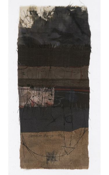
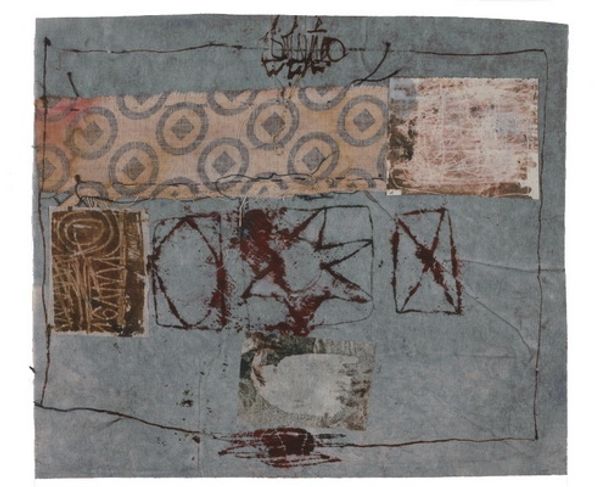
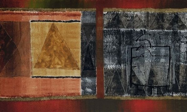
Dimensions: 63 x 207 cm
Copyright: Pavlo Makov,Fair Use
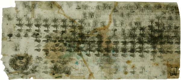
Pavlo Makov made 'Back to Krasny Kut' using a kind of wash technique, almost like he's staining the paper to create these rows of almost tree-like shapes. The colors are muted, mostly browns and blacks, except for this jolt of red in the center that's really eye-catching. The surface of the paper looks aged and distressed, like it's been through something. I think Makov is using this technique to suggest memory and history, the way things fade and change over time. Take a look at the way the dark marks bleed into the paper. It feels kind of melancholic, doesn't it? Like a landscape seen through a rain-streaked window. It reminds me a bit of Anselm Kiefer, in the way he uses material to evoke a sense of loss and the weight of history. But Makov's touch is lighter, more delicate. Ultimately, it's about layers, both of paint and of meaning.
Comments
No comments
Be the first to comment and join the conversation on the ultimate creative platform.
More like this