Copyright: Hannelore Baron,Fair Use
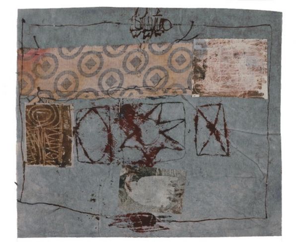
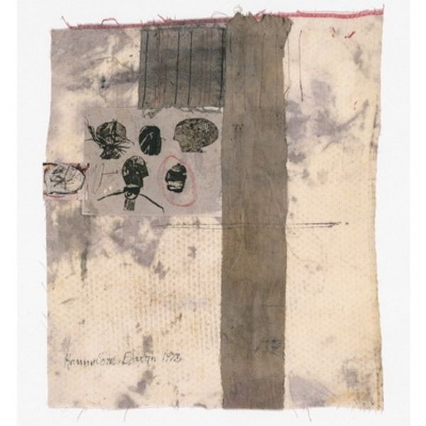
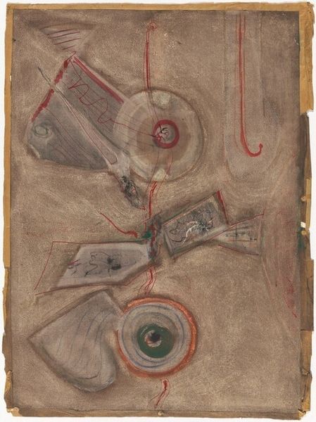
Editor: Here we have Hannelore Baron’s “Spring Letter” from 1973, a mixed-media collage on paper. The layering and muted colors give it such a fragile, almost melancholic feel. What strikes you most about its visual composition? Curator: The composition is indeed intriguing. Consider the spatial relationships: a dark, solid square juxtaposed with semi-transparent, linear forms. Observe how Baron utilizes line, creating implied shapes and a sense of depth despite the flatness of the collage. The superimposition creates both harmony and tension, wouldn't you agree? Editor: Definitely, the tension is key. It’s like she’s built up a world, but one that's delicate and about to fall apart. I’m also interested in her line, how scratchy and imperfect it looks! Curator: Precisely! The line quality disrupts any illusion of perfection. Notice how she contrasts organic and geometric forms? It's through such structural elements that Baron conveys meaning, beyond any literal representation. Editor: So you're seeing the arrangement itself as the primary message, rather than any particular narrative? Curator: Indeed. Let us not forget the material itself: found paper, ink, glue... their very presence as humble, repurposed elements is significant. How do these textural choices impact the overall experience, in your opinion? Editor: The textures make it feel so intimate. Thinking about how each element contributes to the mood is reshaping how I initially interpreted the artwork! Curator: And I found our conversation revealing. Deconstructing the structural elements has shed light on an alternative, more nuanced, approach to the artwork and collage making itself.
Comments
No comments
Be the first to comment and join the conversation on the ultimate creative platform.
More like this