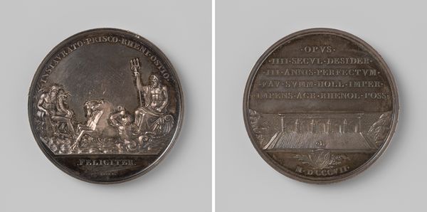
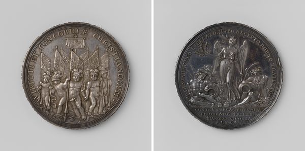
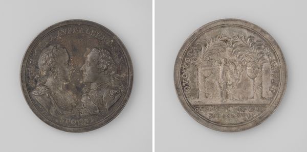
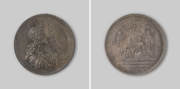
Inname van Bonn, Huy, Limburg, Rheinberg en Geldern, penning te Alkmaar uitgereikt aan de deelnemers van een loterij voor het Aalmoezeniershuis 1703
0:00
0:00
metal, sculpture
#
medal
#
baroque
#
metal
#
sculpture
#
sculpture
Dimensions: diameter 4.7 cm, weight 42.51 gr
Copyright: Rijks Museum: Open Domain
Editor: This metal medal, created by Martin Schmeltzing in 1703, is titled "Inname van Bonn, Huy, Limburg, Rheinberg en Geldern." The composition, especially on the front side, is quite dense with figures and text. How would you begin to interpret this work? Curator: Let us observe how the composition guides our eye. Notice the prominent female figure. Her verticality dominates the left side of the medal, drawing our attention upward. Consider how the artist used shallow relief to differentiate the foreground from the background, creating spatial depth and focusing on thematic elements, as well as textual placement. Editor: The relief is fascinating; it's almost like a low-cut cameo. But what is she holding, and who are those figures below her? Curator: Those, I believe, are visual clues for historical narratives related to political alliances and military campaigns during the early 18th century. I invite you to notice the balance created between these figurative groups to identify additional compositional techniques that communicate additional information beyond our initial observations of depth and volume. Does any particular element of either side draw your focus more than the others, in contrast or similarity to how you approached it at first glance? Editor: On the other side, the symmetry created with the winged figure above and what seems to be a child between decorative structures makes that my central focus. Considering this and how both sides are in visual dialogue with each other despite the separate scenes makes for an interesting take away. Curator: Precisely. The balanced structure reinforces an idea about symmetry, echoing Baroque preferences but rendered through sculptural relief on a small object meant for reward. Editor: That clarifies how form complements the medal's function, rewarding participants for a charity lottery through this artistic form. It all feels intentional.
Comments
No comments
Be the first to comment and join the conversation on the ultimate creative platform.
More like this