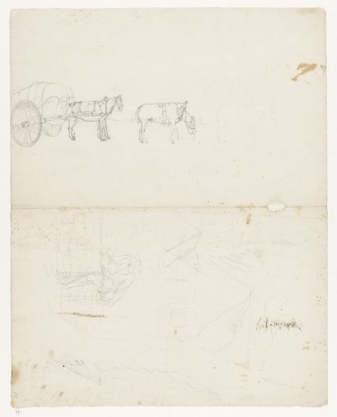
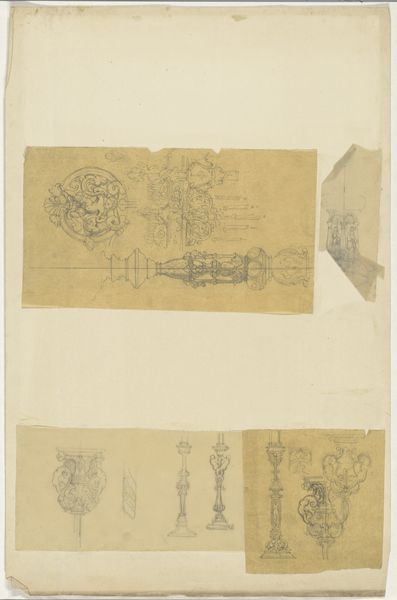
drawing, graphic-art, paper, typography, pencil, graphite
#
drawing
#
graphic-art
#
toned paper
#
light pencil work
#
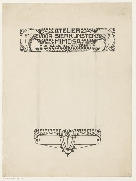
art-nouveau
#
quirky sketch
#
pencil sketch
#
paper
#
form
#
personal sketchbook
#
typography
#
ink drawing experimentation
#
pen-ink sketch
#
pencil
#
line
#
graphite
#
sketchbook drawing
#
pencil work
#
sketchbook art
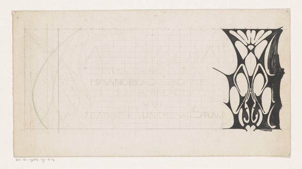
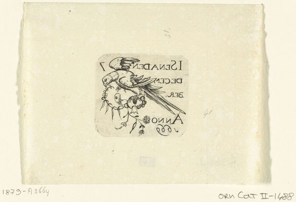
Dimensions: height 234 mm, width 130 mm
Copyright: Rijks Museum: Open Domain
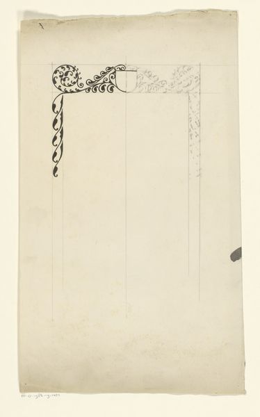
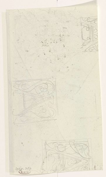
Curator: Looking at this work, formally titled "Ontwerp voor vignet R.W.P. de Vries Jr. Edam," an intriguing design from sometime between 1884 and 1952 by Reinier Willem Petrus de Vries. It's rendered in pencil, ink, and graphite on paper— a design study, it appears. What is your initial read of this design, and what feelings does it invoke in you? Editor: My first impression is one of quiet confidence and also experimentation, if I can link those together. It has this muted palette. And a sense of something crafted slowly and with attention, not aiming for perfection, but for… authenticity, maybe? Curator: It definitely encapsulates the burgeoning aesthetic and typographic explorations of the period, edging towards Art Nouveau, wouldn’t you say? Vignettes like these often served to brand businesses or publications. We have the artist's name and the city of Edam rendered within, so presumably, it was related to de Vries. Editor: It's a design, yes, but it also makes me think about identity. About who gets to create identities and for whom. Edam is also a place with history, which certainly comes through in these muted lines. I want to know whose brand he wanted to establish. It is the ‘who’ that I am mostly interested in, in relation to their social and artistic setting. Curator: The "who" matters immensely, doesn’t it? As you rightly point out, the historical context can make the interpretation multifaceted. Knowing that De Vries worked across a range of applied arts during a period of social change highlights the interplay between aesthetics and the world at large. Editor: I suppose it’s easy to simply admire the composition—the lines, the spacing. But approaching a work like this, one also needs to recognize this artwork as a result of choices and opportunities that not everyone had at that specific historical moment. How does De Vries' identity shape his perception of what constitutes an effective, appealing design, for example? Curator: Precisely. The visual language used in such vignettes is never neutral, carrying undertones and reflecting societal norms. Recognizing the subtle layers embedded in such a seemingly simple graphic-art underscores the need to interpret and assess how identities are visually constructed and received. Editor: Yes, understanding those power dynamics within the artwork pushes the analysis deeper, hopefully challenging any uncritical embrace of historical aesthetics, by understanding those historical power dynamics in visual culture. Thanks for walking me through the multiple layers of this sketch. Curator: Thank you for lending your perspective; together, we've shed more light on the historical vignette beyond the mere surface.
Comments
No comments
Be the first to comment and join the conversation on the ultimate creative platform.
More like this