drawing, paper, pencil
#
drawing
#
paper
#
form
#
geometric
#
pencil
#
geometric-abstraction
#
line
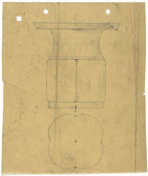
Dimensions: height 143 mm, width 139 mm
Copyright: Rijks Museum: Open Domain
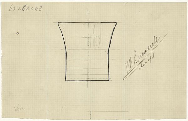
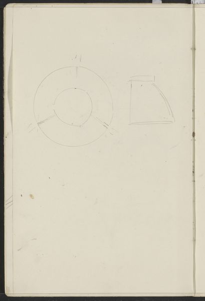
This is Mathieu Lauweriks' "Ontwerp voor een doopbeker," a design for a baptismal font. You can see the initial lines sketched out on what looks like graph paper. I find myself drawn to the grid, which is visible beneath the sketch, and how it relates to the cup itself. The sketch isn’t quite a perfect rendering; we see that it is made by hand, the wavering verticals and horizontals. Maybe this is what makes it so appealing. The grid makes me think of Agnes Martin and her own obsession with the line, of a structure just barely holding. There's a tension between the precision of the grid and the freehand sketch. It speaks to the way we try to contain or define something, like faith, within boundaries. The materiality of the paper and the pencil line is so apparent, so upfront. This piece reminds me that art is often about the process, the journey of creating, more than the final, fixed image.
Comments
No comments
Be the first to comment and join the conversation on the ultimate creative platform.
More like this