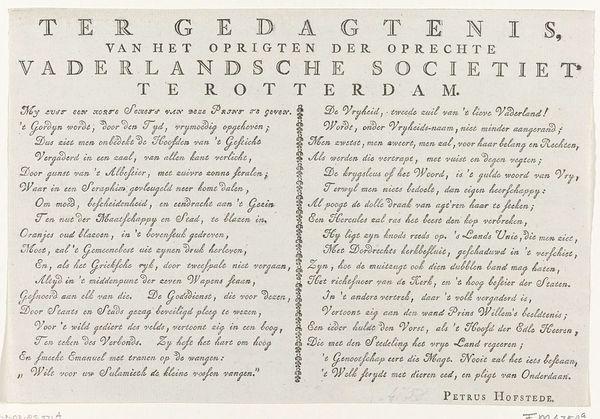
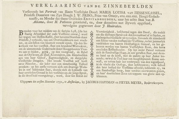
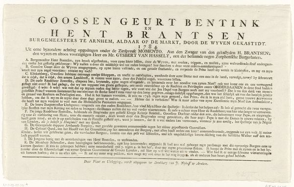
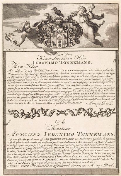
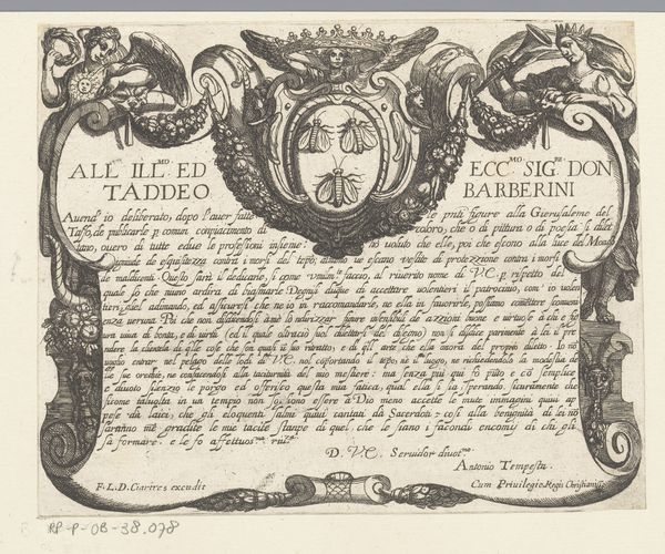
graphic-art, print, typography, engraving
#
portrait
#
graphic-art
#
medieval
#
script typography
#
hand-lettering
#
dutch-golden-age
# print
#
old engraving style
#
hand drawn type
#
hand lettering
#
typography
#
hand-drawn typeface
#
thick font
#
pen work
#
golden font
#
engraving
#
historical font
Dimensions: height 185 mm, width 216 mm
Copyright: Rijks Museum: Open Domain
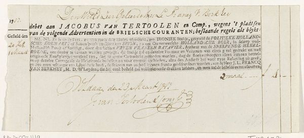
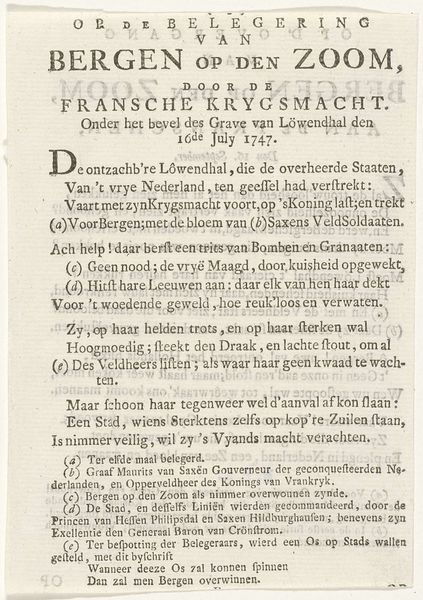
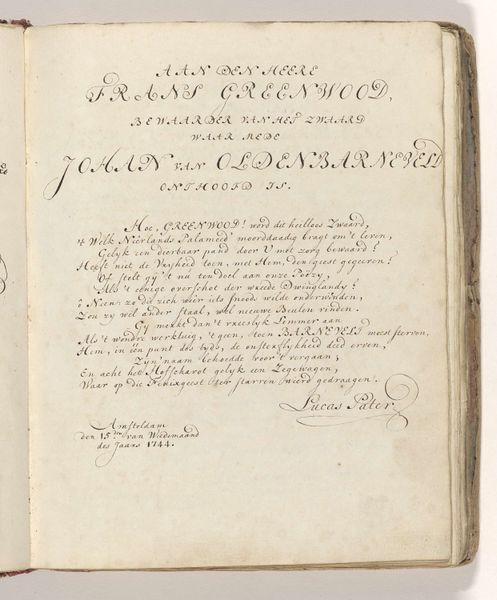
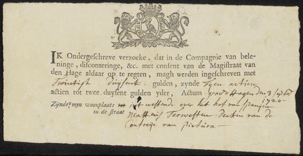
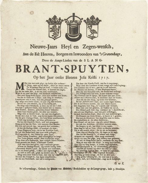
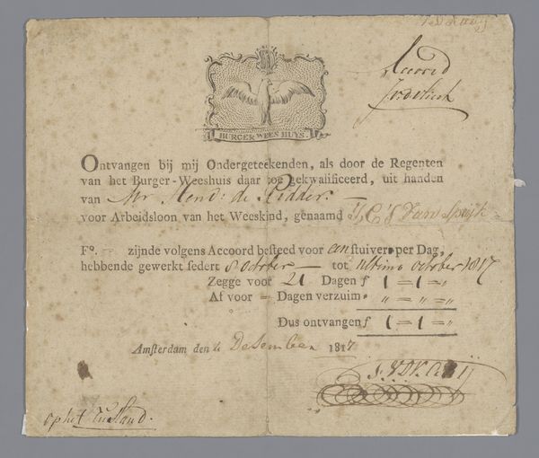
Editor: We’re looking at “Begrafenisbriefje voor de begrafenis van Johannes Rannink, 1747,” an engraving dating back to 1787. It looks like a funeral announcement. The composition strikes me as very formal, even severe. What catches your eye? Curator: Its striking formalism resides in its very graphic construction. Note the deliberate choice of typeface, lending it an immediate archaic character, compounded by its almost mathematical balance and geometric layout, reminiscent of early printed documents. Do you observe anything in particular about its spatial design? Editor: Well, the text dominates, but there are these small decorative elements—a crown, a little figure with a spear, and a sort of vase or urn. They seem almost like afterthoughts. Curator: Not quite, because these graphic symbols act as visual semiotics to frame the primary textual narrative; observe how they echo in a hierarchical dance of visual weights. They may appear minimal, yet they speak volumes in adding levels to its structural narrative, creating an artifice of layered meaning. How does that altered dynamic now change your prior assessment? Editor: I see. Now the text and ornamentation seem purposefully balanced. The images enhance, but also punctuate the script. The framing motifs draw your eye across the announcement. I was hasty in my first opinion! Curator: That layered assessment is correct. Remember, the form embodies intent. What does this reveal about how graphic art uses layout to amplify or even undermine verbal communication of somber intent? Editor: Now, considering how carefully everything is arranged and lettered, it seems as though equal thought was applied to the structure of images and words. This careful balance gives a clearer impression about that solemn occasion it describes. Curator: Indeed, form becomes the prime conduit through which content achieves its final, lingering articulation, revealing so much more of cultural importance.
Comments
No comments
Be the first to comment and join the conversation on the ultimate creative platform.
More like this