Circulaires betreffende een hulde aan Albert Neuhuys (1844-1914) Possibly 1904 - 1925
0:00
0:00
diversevervaardigers
Rijksmuseum
print, typography, poster
#
sand serif
#
art-nouveau
#
script typography
# print
#
old engraving style
#
hand drawn type
#
typography
#
hand-drawn typeface
#
thick font
#
handwritten font
#
golden font
#
poster
#
historical font
#
columned text
Copyright: Rijks Museum: Open Domain
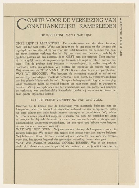
This notice, made in 1904 by various makers, is all text, no image in sight. It’s like a field of marks, all marching in a line, each letter with its own particular wobble and weight. It’s a reminder that even the most seemingly straightforward forms can be full of subtle variation and life, if you really look. The texture of the page itself, a kind of antique cream, feels important. I can imagine the paper feeling slightly rough to the touch, that the ink probably sits slightly raised from the surface. The whole thing has a kind of handmade quality, even though it’s clearly a printed document. There’s a connection to the hand, to the body, to the labor of making. The way the letters are spaced, a little uneven, creates its own kind of rhythm. This feels like a cousin to the work of someone like Hanne Darboven, where the act of writing, of marking, becomes the artwork itself. Ultimately it’s about seeing the potential for art in the everyday, in the overlooked. It reminds us that art is everywhere, if you know how to look.
Comments
No comments
Be the first to comment and join the conversation on the ultimate creative platform.
More like this