drawing, paper, ink
#
drawing
#
aged paper
#
toned paper
#
ink paper printed
#
sketch book
#
hand drawn type
#
paper
#
form
#
11_renaissance
#
personal sketchbook
#
ink
#
hand-drawn typeface
#
ink colored
#
line
#
sketchbook drawing
#
northern-renaissance
#
sketchbook art
#
calligraphy
Dimensions: height 196 mm, width 269 mm, height 227 mm, width 345 mm
Copyright: Rijks Museum: Open Domain
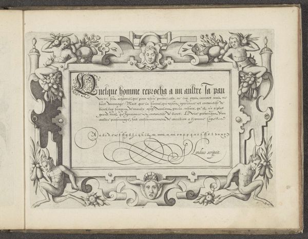
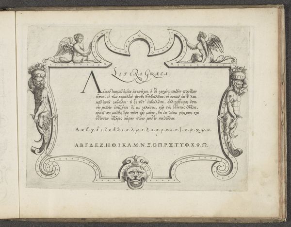
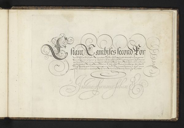
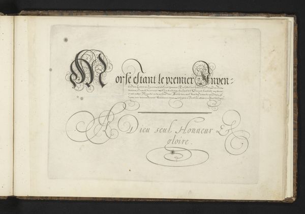
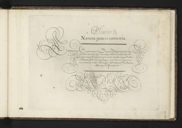
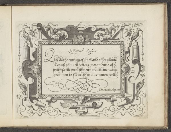
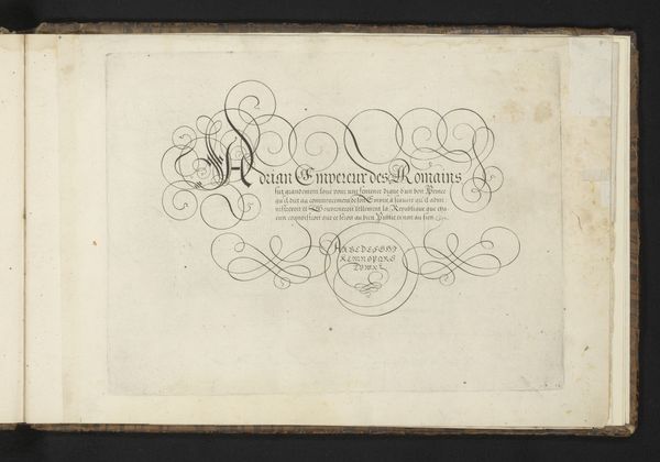
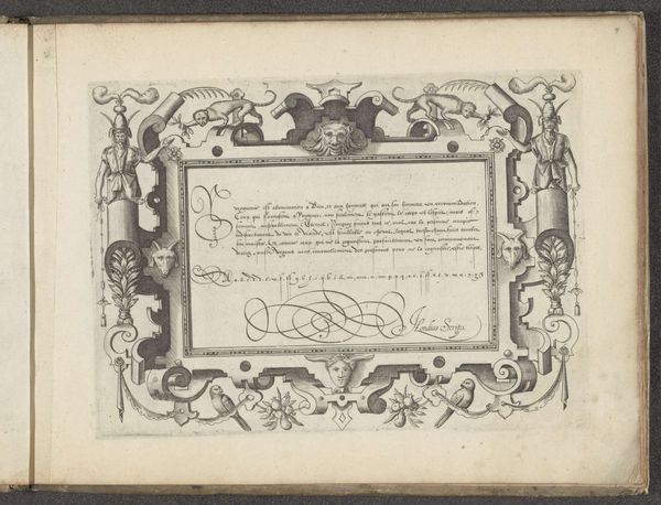
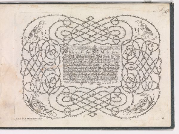
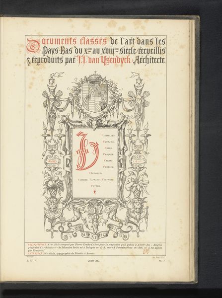
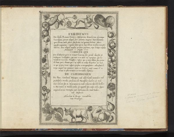
Curator: Here we have an example of a writing manual or "schrijfvoorbeeld" created by Cornelis Dircksz. Boissens in 1605. The artwork, rendered in ink on paper, features calligraphy and hand-drawn type, characteristic of the Northern Renaissance style. Editor: It feels like stumbling upon a secret, a hidden world of meticulously crafted script. It makes me wonder who the intended audience was. Aristocrats learning penmanship, perhaps? It feels strangely intimate, like peering over someone's shoulder. Curator: Precisely. The work emphasizes form through line, employing tonal contrasts. The lettering serves not only a communicative function but also acts as a visual motif. Notice how Boissens uses the weight of the ink to guide the viewer's eye and to give prominence to certain letters. Editor: Those elaborate flourishes bordering the main text remind me a little of elaborate vines or architectural details. I can see how much artistry was devoted to elevating mere writing into a piece of fine art. It suggests a deep respect, almost reverence, for language itself. Curator: Absolutely, and consider the text: “Celuij est honnore entre les hommes.” Then there's that prominent declaration: "Virtute non favoribus" at the bottom. Boissens underscores virtue over mere social grace, offering moral instruction alongside his technical demonstrations. Editor: I like that little jolt of moral instruction – virtue, not just sucking up! It gives the piece a spine, like a gentle push back against vanity. The toned paper seems almost alive. I bet holding it in your hands would connect you to the person who painstakingly crafted each letter, centuries ago. Curator: Indeed, its value transcends function; the piece is an elegant exercise in control and intention. The semiotic structure inherent in script gains elevated expression via ornamental enhancements that transcend pure legibility. Editor: So, a kind of ancestor to the beautifully designed fonts we see everywhere today, where practicality meets sheer artistic flair? I will look at script in a very different way from now on. Thanks! Curator: A necessary skill then and a visual delight even now. I think this offers a remarkable confluence of art and practical instruction.
Comments
No comments
Be the first to comment and join the conversation on the ultimate creative platform.
More like this