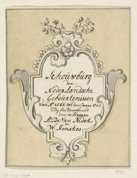
graphic-art, print, etching, typography, engraving
#
portrait
#
graphic-art
# print
#
etching
#
old engraving style
#
typography
#
cityscape
#
history-painting
#
engraving
Dimensions: height 224 mm, width 333 mm
Copyright: Rijks Museum: Open Domain
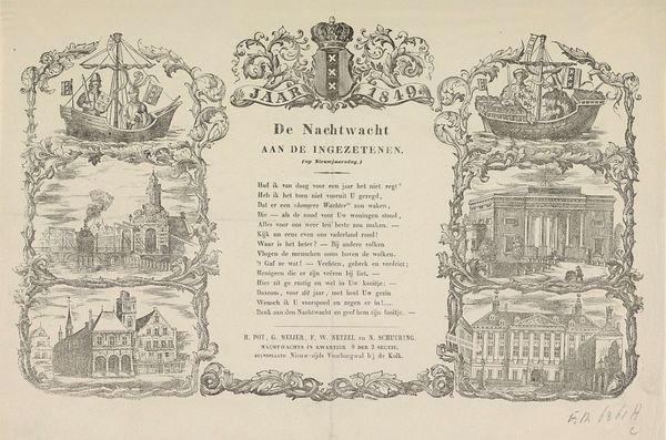
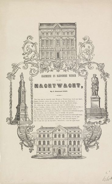
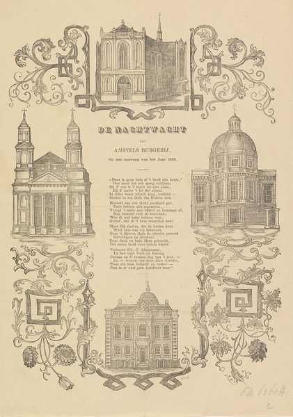
Editor: Here we have a graphic print titled "Kermisprent van de Amsterdamse nachtwacht voor het jaar 1849," or "Carnival Print of the Amsterdam Night Watch for the year 1849" from the same year. It's made with etching and engraving. The print shows several Amsterdam buildings in decorative frames, with typography in the center. I'm struck by the formal composition, yet the playful, almost cartoonish rendering of the architecture. What do you see in this piece? Curator: Intriguing. Focusing on the visual language, one immediately notices the tension between the linear precision of the architectural depictions and the florid embellishments surrounding them. The use of etching allows for a remarkable level of detail in rendering the facades, highlighting their structure and articulation of space. Do you see how each building's elevation is presented almost as a study in perspective? Editor: Yes, they're quite precise, as technical drawings, almost. Curator: Precisely. And consider how the typography is integrated. The font choices and layout are meticulously balanced with the architectural drawings. There's a distinct contrast between the ornamental frames and the more rational rendering of the architecture. Editor: I see. So, it's less about what the buildings *are*, and more about *how* they're depicted, the relationship between different representational styles used? Curator: Precisely! The formal arrangement invites one to decode the interplay of these elements: the lines, forms, and the deliberate juxtaposition of different styles contribute to a visual dialogue, which creates the artwork's central effect. Editor: That makes so much sense. I was initially drawn to the cartoonish style but now I see the value of a strict formal analysis to find those structural choices. Curator: Indeed. Formal analysis reveals the artist’s calculated approach to design. By observing this the artwork shows a distinct perspective, where it creates new meanings which opens itself to the viewers.
Comments
No comments
Be the first to comment and join the conversation on the ultimate creative platform.
More like this