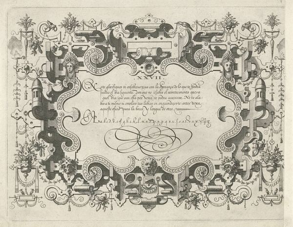
drawing, graphic-art, print, ink
#
drawing
#
graphic-art
# print
#
form
#
ink
#
geometric
#
line
#
northern-renaissance
#
calligraphy
Dimensions: height 204 mm, width 341 mm
Copyright: Rijks Museum: Open Domain
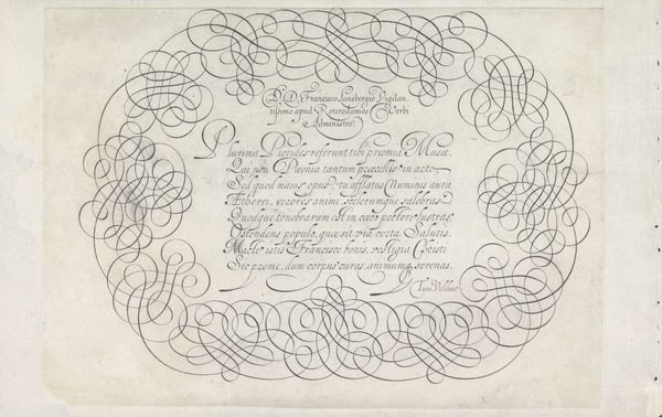
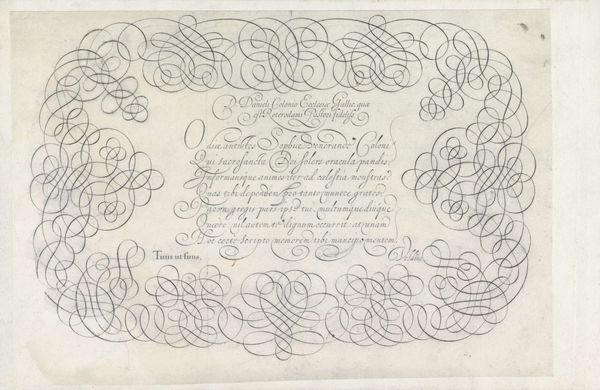
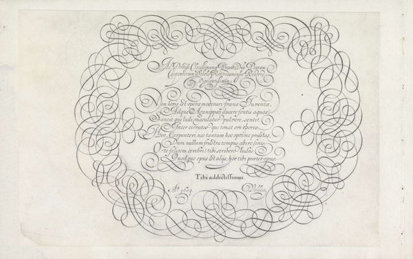
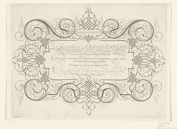
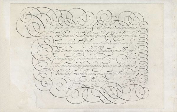
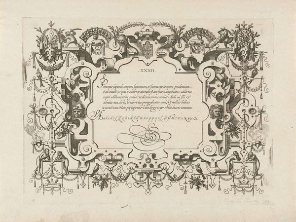
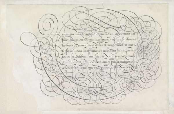
Curator: Let's turn our attention to this intricate piece titled "Calligraphic Design for a Title Print" by Jan van de Velde I, created around 1605. It's a fascinating example of Northern Renaissance graphic art, executed in ink. Editor: Wow, it looks like a spider web spun by a very meticulous, and perhaps slightly obsessive, arachnid! The delicacy of the lines is quite mesmerizing. It's all form and fancy, really striking. Curator: Indeed. The focus on pure line, a hallmark of the era, is evident. Consider the socio-economic context; calligraphy wasn't merely decorative but crucial for legal documents, religious texts, and personal correspondence. Skills in producing decorative prints such as this one signalled mastery of letterpress and printing industries which, since their emergence in the mid-15th century, had redefined production and readership. Editor: It does feel incredibly purposeful. It makes you think about the patience involved. I mean, each swirl and flourish perfectly placed and balanced—the labor involved must have been tremendous! Does knowing about this work’s origin change how we should be seeing type-face in today's publishing world? I can just feel this print wanting to challenge my perspective. Curator: Absolutely! This wasn't simply about aesthetic appeal; it also showcases an expert's mastery of penmanship, effectively communicating not only the meaning of words but the very act of skillful creation. Look at how line becomes form and texture. Even geometric shapes enter to establish certain kinds of frames. It emphasizes not only functional literacy and also haptic literacy for future readers who might interact with this page. Editor: I get what you mean. You're right to imply a challenge between form and functionality here; the legibility certainly is subordinate to artistry here. The swirls and curves—while visually appealing—tend to obfuscate meaning for sure! I just feel like there's a deeper meaning here that could challenge our present sensibilities as both artists and viewers... Perhaps I might try something new. Curator: A perfect way to approach Van de Velde's hand. From production methods to artistry, I really get your perspective and I agree. Thanks. Editor: You too, bye.
Comments
No comments
Be the first to comment and join the conversation on the ultimate creative platform.
More like this