Copyright: Public Domain: Artvee
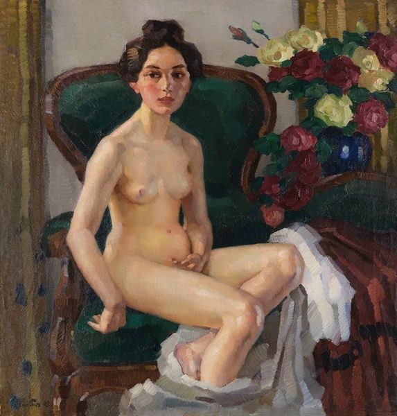
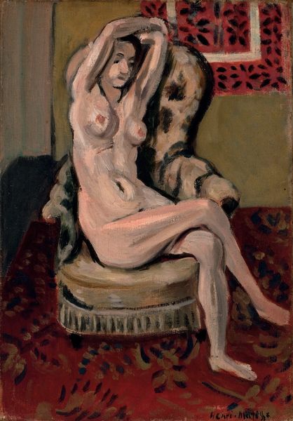
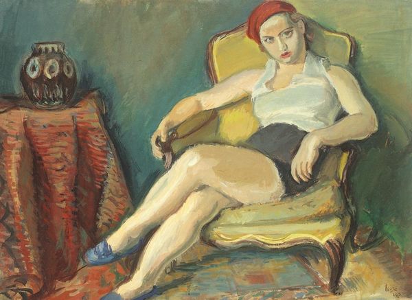
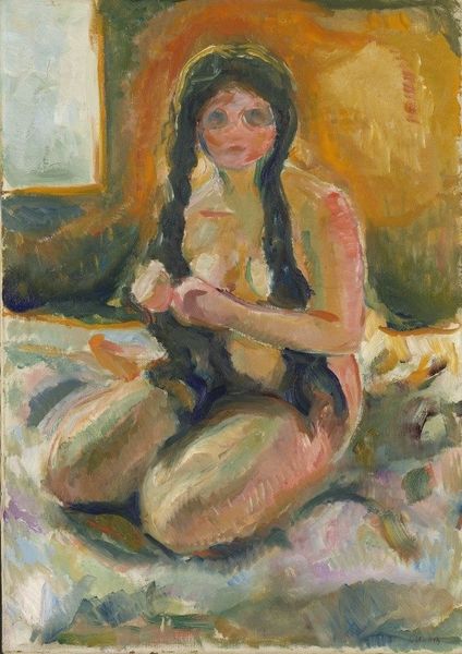
Editor: Nils Dardel painted "Model in a Green Chair" in 1928, using oil paint. I'm struck by the contrast between the model's somber expression and the cheerful floral pattern of the chair. How do you interpret this work? Curator: Observe how the artist manipulates colour and form to create tension. The cool greens and reds of the chair's upholstery compete with the warm flesh tones, yet neither dominates. Consider the positioning of the figure: her limbs are arranged almost symmetrically, but her gaze is directed off to the side. What effect does that asymmetry achieve? Editor: It makes me wonder what she’s looking at. The pose feels contained, but the eyes hint at something more… unresolved? Curator: Precisely. And note the brushwork: Dardel employs relatively broad strokes, almost flattening the forms, which reduces the illusion of depth. The figure is thus presented not as an object of desire, perhaps, but as a study in spatial relationships. Does the pattern of the chair compete with, or complement, the figure? Editor: I see what you mean about the flatness. At first, the floral pattern seemed purely decorative, but now I'm considering it as another layer of form, interacting with the figure's own contours and the composition. Curator: And the muted palette contributes to this tension. There's an understated elegance, wouldn’t you agree, even with the directness of the nude form? The composition favours balance and visual dynamics. Editor: It's much more complex than I initially thought! I’ve come to appreciate the artist’s decisions around line, color and overall form. Thanks for illuminating Dardel's choices here! Curator: The pleasure is mine. Considering the formal aspects of a piece, in this focused way, truly reveals the artist's intention and expertise.
Comments
No comments
Be the first to comment and join the conversation on the ultimate creative platform.