drawing, graphic-art, print, paper, typography, ink
#
drawing
#
graphic-art
#
medieval
# print
#
paper
#
typography
#
ink
#
calligraphy
Dimensions: height 200 mm, width 301 mm
Copyright: Rijks Museum: Open Domain
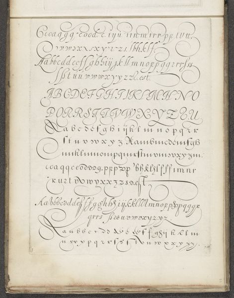
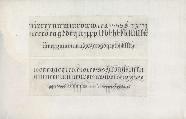
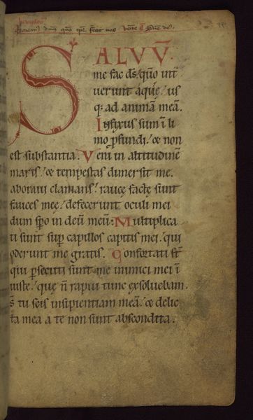
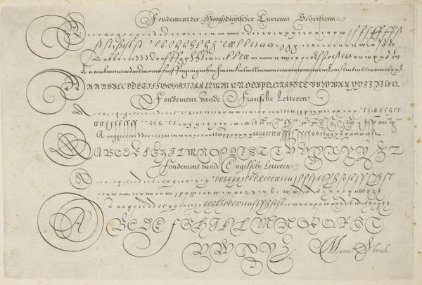
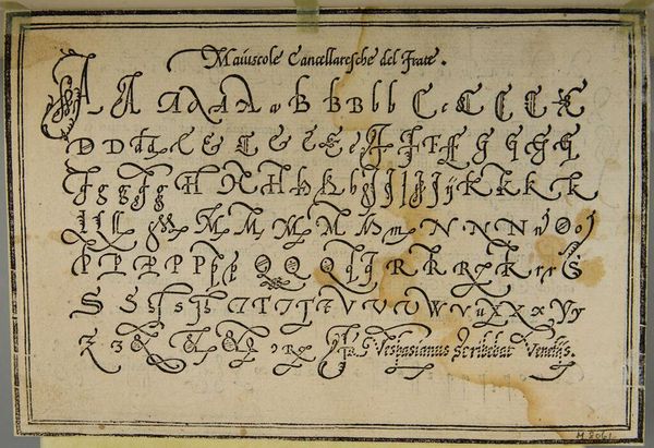
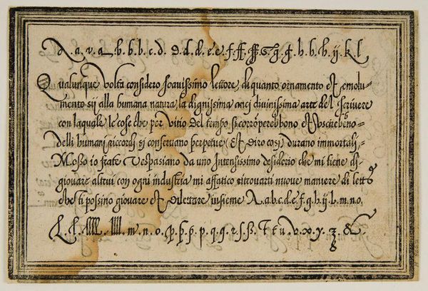
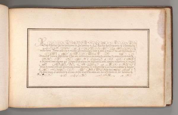
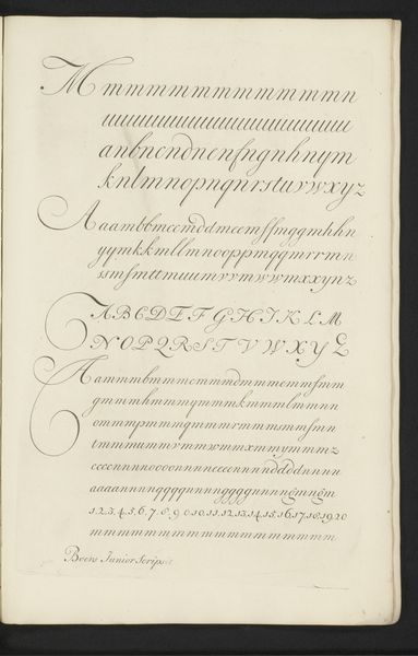
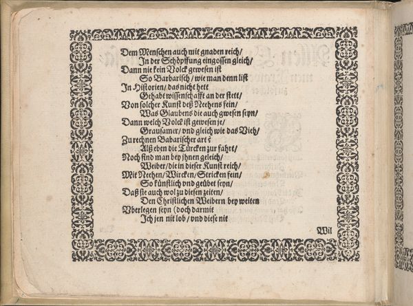
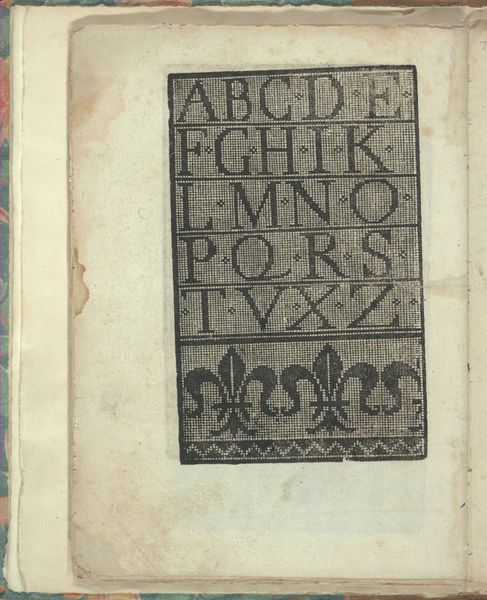
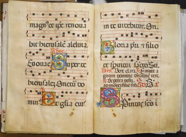
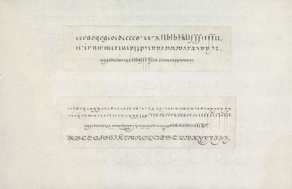
Hans Strick made this page of letter samples sometime around 1600, using pen and ink. It shows examples of Textura, Fraktur, and Bastarde lettering styles. In the 16th century, the ability to write was increasingly valued for commerce and governance, but the teaching of calligraphy was dominated by guilds and religious institutions. Manuals like this one helped democratize access to these skills. Note how the lettering examples emphasize the ways that individual letters can be combined to form full words, and how the textura and fraktur styles make heavy use of abbreviations. These scripts were optimized for rapid writing, and for saving space on costly parchment. As historians, we can examine such artifacts to better understand the social and economic contexts in which they were created. For example, by studying the archives of printing guilds, or the account books of merchants, we can learn more about the value placed on literacy and the impact of new technologies on the world of communication.
Comments
No comments
Be the first to comment and join the conversation on the ultimate creative platform.
