paper, ink
#
medieval
#
paper
#
ink
#
miniature
#
calligraphy
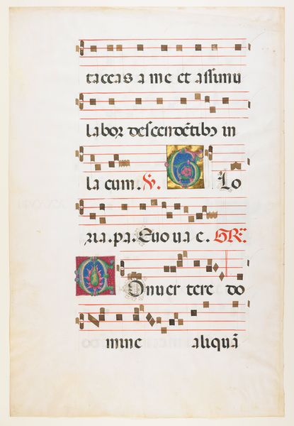
Dimensions: Overall (closed): 23 1/8 x 16 3/4 x 3 5/8 in. (58.7 x 42.5 x 9.2 cm) Overall (opened (approx.)): 23 1/8 x 32 1/4 x 11 in. (58.7 x 81.9 x 27.9 cm) Overall (folio): 22 1/8 x 16 1/8 in. (56.2 x 41 cm) Stave ht.: 1 5/8 in. (4.2 cm)
Copyright: Public Domain
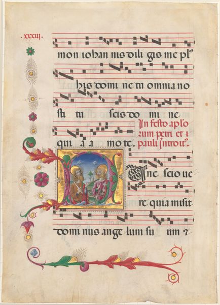
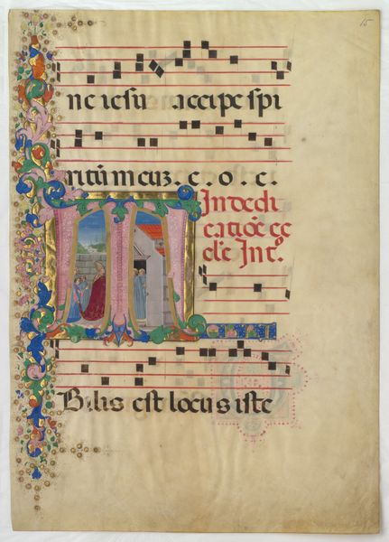
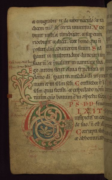
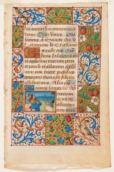
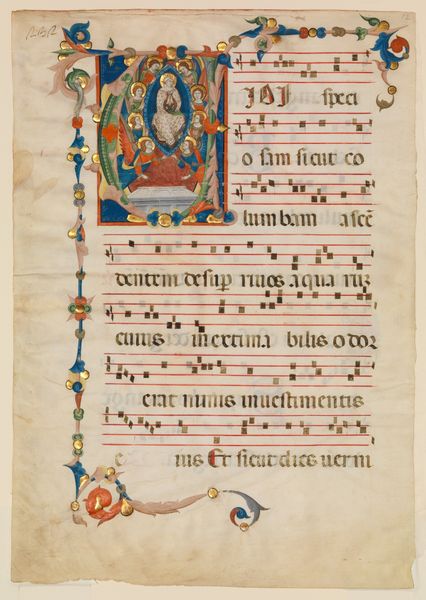
Curator: Here we have a page from a Benedictine Antiphonary, created sometime between 1467 and 1470 by Belbello da Pavia. It’s currently held at the Metropolitan Museum of Art. Editor: Immediately striking are the colours – that vibrant illumination against the aged parchment, the red staves holding those precise, dark notes. There's a lovely visual rhythm to the page. Curator: Yes, the interplay of colour and form is paramount here. Notice how the illuminated letters—particularly the S and the E—are not mere decoration but integral compositional elements, leading the eye through the text and music. Editor: Absolutely. But consider the historical context too. This wasn't simply about aesthetics; it was about power and authority. The Benedictine order was a significant landholder, and these antiphonaries, displayed in monastic settings, reinforced their cultural status through opulent craftsmanship. The intricacy must have also reflected the immense dedication involved. Curator: The lettering itself is a fascinating study in line and shape, wouldn't you agree? The blackletter script provides a beautiful contrast to the more organic forms within the illuminated initials. I am curious as to your interpretation of the text? It is likely from The Book of Psalms. Editor: I understand it’s music and text meant for monastic choral singing, possibly sung for hours daily. The daily rhythm, perhaps, could inspire or constrain artistic expression. Also, think about who commissioned the work, what resources they brought to bear. Did they expect others to find beauty or value in these works, or to be cowed? Curator: Precisely! Each design element is precisely balanced with one another in ways both harmonious and structurally sound, ensuring balance. This harmony ensures a visually complete composition on a plane of its own, something truly breathtaking when compared with lesser works. Editor: I agree that a work of art in its time speaks to the concerns of power structures, but also serves to display a collective desire for transcendence through the divine word made flesh in beautiful form.
Comments
No comments
Be the first to comment and join the conversation on the ultimate creative platform.
More like this