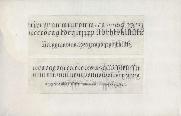
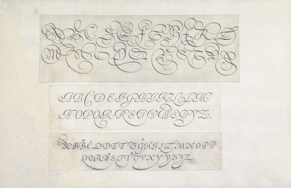
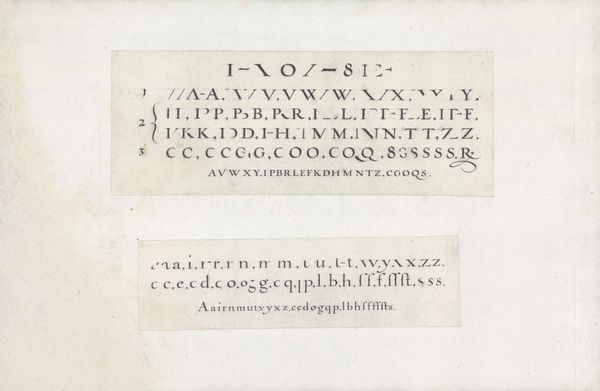
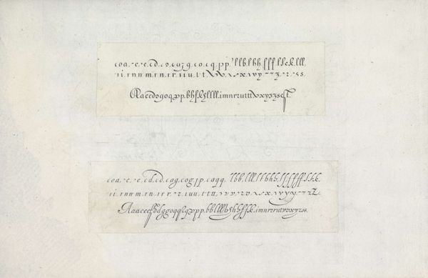
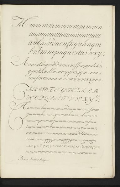
Twee ontwerpen van schrijfvoorbeelden: de bastaert en de Nederlandse staande letter 1605
0:00
0:00
janvandeveldei
Rijksmuseum
drawing, paper, typography, ink
#
portrait
#
drawing
#
paper
#
typography
#
ink
#
northern-renaissance
#
calligraphy
Dimensions: height 52 mm, width 191 mm, height 59 mm, width 202 mm
Copyright: Rijks Museum: Open Domain
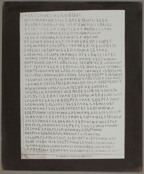
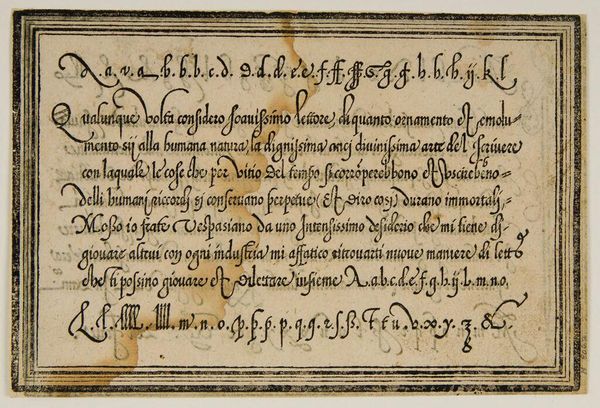
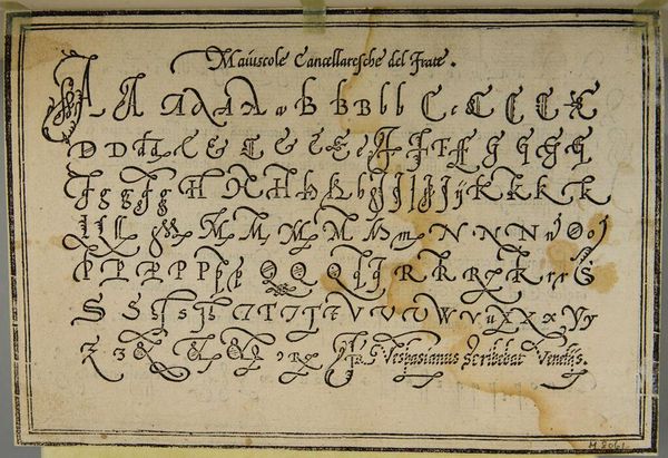
Editor: Here we have Jan van de Velde the First’s “Twee ontwerpen van schrijfvoorbeelden: de bastaert en de Nederlandse staande letter,” created with ink on paper around 1605. I'm immediately struck by how much care and attention must have gone into each stroke. It’s not just writing; it’s a display of skill and almost an art form in itself. What stands out to you? Curator: You’re absolutely right. It *is* an art form, and one that sadly, we've largely lost touch with. These aren’t just letters, they are relics of a time when handwriting was not merely a means of communication, but also a mark of education and social standing. Van de Velde gives us not just letterforms, but a sense of rhythm. Almost a dance of ink on paper. Do you get the impression these samples served as inspiration for his better-known engraved prints? Editor: That’s interesting! It almost feels like looking at musical scores instead of just letters. The precise repetition and slight variations give a kind of… cadence. How did the invention of the printing press change the need for the broad range of elaborate handwriting styles? Curator: That's a keen observation! With the printing press came standardization, but also something of a loss. The personal touch, the unique flourish— these became less crucial in everyday life but paradoxically, increasingly valued as artistic skills. Pieces like this one acted both as guides and aspirational objects of virtuosity, I imagine. There's something so beautiful about this combination of practical purpose and aesthetic striving. It makes you consider, what skills are we in danger of losing in *our* modern age? Editor: That's a great question! I never thought about calligraphy and the printing press that way, and now I feel a lot more appreciative of not just what’s written, but *how* it’s written, and by extension, *who* wrote it! Thanks! Curator: My pleasure.
Comments
No comments
Be the first to comment and join the conversation on the ultimate creative platform.
More like this