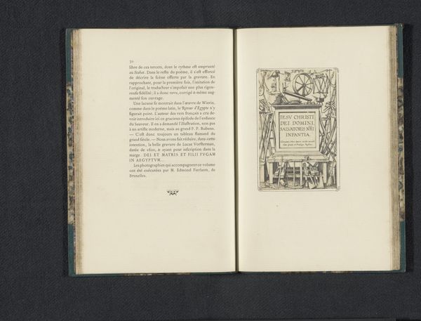
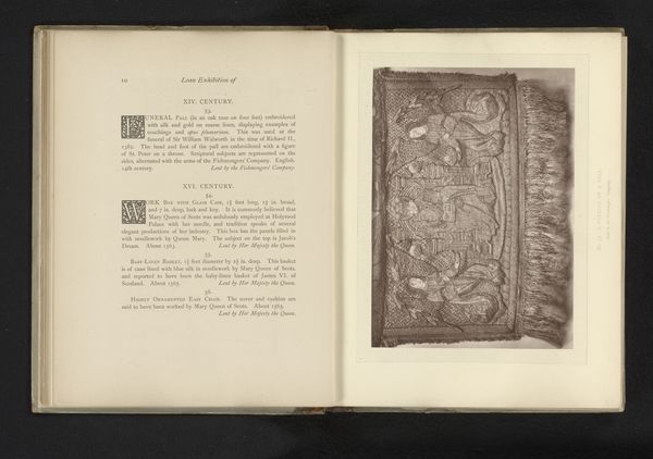
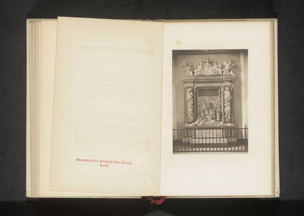
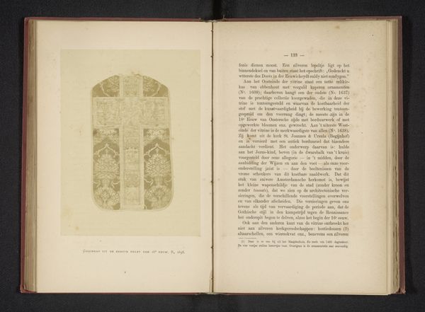
print, photography, collotype, engraving, architecture
#
aged paper
#
script typography
# print
#
photography
#
collotype
#
hand-drawn typeface
#
fading type
#
geometric
#
thick font
#
white font
#
handwritten font
#
golden font
#
italian-renaissance
#
engraving
#
architecture
#
historical font
#
columned text
Dimensions: height 147 mm, width 103 mm
Copyright: Rijks Museum: Open Domain
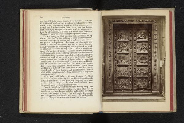
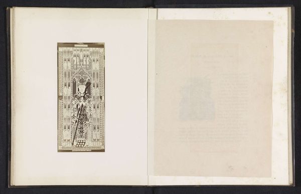
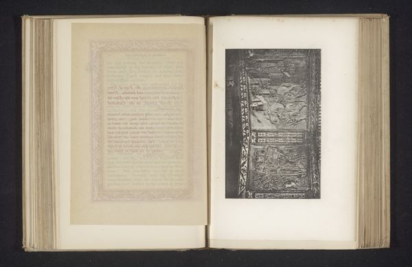
Editor: We’re looking at a collotype photograph from before 1871 by Giacomo Brogi titled "Door of the Baptistery in Florence.” It shows a reproduction of the intricate doors, almost like it's a page torn from a very old book. The photo's aged, and it has this beautiful, melancholic feel. What strikes you about this piece? Curator: Melancholic is a beautiful way to describe it! For me, seeing this, I think about layers – literal layers of the photograph, but also the layers of time and interpretation. Brogi isn't just showing us a door; he's presenting a Renaissance masterpiece filtered through the lens of 19th-century photography. And the use of collotype… it softens the image, almost like a memory fading. Do you get a sense of that distance? Editor: Definitely. It's not a crisp, modern image; it's got a whisper of the past. All those inscriptions and geometric forms make the work feel imposing yet serene, I find it difficult to focus my eye on the forms... Curator: Serene is interesting. For the original Renaissance viewer, would the door evoke serenity or perhaps something more complex? I wonder what the purpose was of that specific piece. The gold hints and strong font... Perhaps that choice reflects an attempt to legitimize something. Editor: Ah, I get it. Now that I reflect on that... given that the picture features an historical document with columned text... maybe they tried to legitimize their claim through some official documents in columns of script typography? Curator: Precisely! And I also imagine the document probably shows a drawing of what they are alluding to. I suppose Brogi is prompting us to reflect on how history is translated and re-presented through art, and how it can still manage to hold immense beauty through layers of fading memory and new insights! Editor: I hadn’t thought of it that way – the layers of history, interpretation, and technique all impacting how we see it today. This whole "aged document aesthetic" almost makes you question your vision as you're looking at this print. Fascinating. Thanks!
Comments
No comments
Be the first to comment and join the conversation on the ultimate creative platform.
More like this