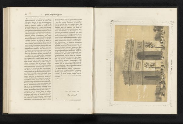
Reproductie van een prent van een ontwerp voor het Franse paviljoen op de Wereldtentoonstelling van 1883 te Amsterdam before 1883
0:00
0:00
graphic-art, print, poster, engraving, architecture
#
graphic-art
#
aged paper
#
art-nouveau
#
homemade paper
# print
#
sketch book
#
hand drawn type
#
personal sketchbook
#
hand-drawn typeface
#
thick font
#
sketchbook drawing
#
poster
#
sketchbook art
#
engraving
#
architecture
#
historical font
Dimensions: height 81 mm, width 236 mm
Copyright: Rijks Museum: Open Domain
Editor: Here we have a reproduction of a print titled "Reproductie van een prent van een ontwerp voor het Franse paviljoen op de Wereldtentoonstelling van 1883 te Amsterdam," made before 1883. The graphic art is displayed in an open book. I’m immediately struck by the stark contrast and linear detail. What aspects of the formal qualities stand out to you? Curator: The rigorous geometry undoubtedly captures attention. Observe how the design utilizes the grid-like structure, creating individual frames. Note the consistent weight of the lines across the surface. It offers a framework, while permitting individualized expression within each smaller pictorial field. Editor: So the grid is a deliberate organizational tool? Is that the primary structural element? Curator: Precisely. But look closer at the deployment of positive and negative space. Notice how the dense aggregations of detail within each panel are counterpointed by the stark, uncluttered margins. These formal relationships construct a dynamic visual rhythm. This ensures our eye is engaged without being overwhelmed by the intricacy of the composition. Editor: That's an interesting point. I hadn’t considered how the blank space contributes. Curator: Indeed. Consider how the artist employed symmetry and asymmetry to create balance. Each framed tableau presents an inward focus, which invites extended visual processing. What do you notice? Editor: It's interesting how the overall layout seems so ordered, almost clinical, while the images within the rectangles are diverse. So the tension creates visual interest? Curator: Yes. The work uses geometric division to produce its visual identity. By calling our attention to how forms relate to one another, we start to appreciate the intention behind the artist's strategy and its final output. Editor: I see it now. Thank you, that makes the image so much clearer. Curator: I agree; thinking about the intrinsic forms allows us to see the image in new and unexpected ways.
Comments
No comments
Be the first to comment and join the conversation on the ultimate creative platform.
More like this